How to Create a User Friendly Website?
So, you want to create a website that people actually enjoy using? You’re on the right track.
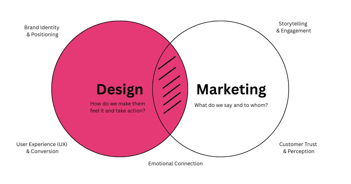
Many people assume that a good looking website is the ultimate goal. But that’s only half the story. The real goal isn’t just to impress—it’s to connect. A truly effective website needs to be more than just pretty—it needs to be functional, intuitive, and downright helpful. This is what we mean by a user friendly website.
It’s all about putting yourself in the shoes of your visitors and creating an experience that feels seamless and effortless. If you’re wondering how to bridge that gap between looking good and feeling easy, you’ve come to the right place. Let’s break down exactly how to achieve a user friendly website design.
What Does “User Friendly Website” Actually Mean?
In simple terms, a user friendly website is one that your visitors can use without getting frustrated, lost, or confused. It’s about creating a seamless journey from the moment they land on your page to the moment they take action—whether that’s buying a product, filling out a form, or finding your contact info.
The user-friendliness of a website is what separates a site people quickly click away from one that actually drives results. But what exactly makes a website feel easy and engaging to use? Let’s dive in.
Key Features of a User Friendly Website
1. Easy and Intuitive Navigation
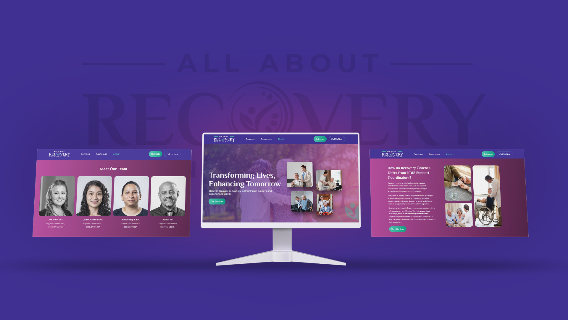
Intuitive navigation is the non-negotiable foundation of a user friendly website design. The reason is human nature itself. Our brains are built to take shortcuts and conserve mental energy—this is known as cognitive load. A confusing menu or cluttered layout creates friction against this very instinct. Instead of exploring your content, visitors feel frustrated, and that frustration sends them straight to a competitor whose website feels easy and intuitive.
Some common mistakes include hiding important pages in irrelevant dropdown menus, repeating the same information across multiple pages, or making users work too hard to find basic details like pricing or “About Us.”
Your goal is to make everything obvious. A visitor should understand what you do within seconds of landing on your homepage. Organize your pages logically, use clear labels (like “Services,” “Contact,” “Blog”), and ensure your main menu is a helpful guide, not a puzzle.
2. A Clean, Clutter-Free Design
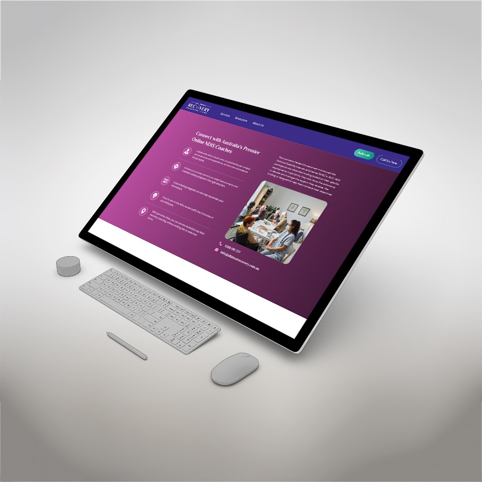
Less is almost always more. While it’s tempting to use every trendy thing like animations and colors under the sun, a minimalist approach often wins.
Through our own audits, we’ve seen that websites overloaded with text, clashing colors, and complex graphics can overwhelm a user. Google found that users rate visually simple websites as more beautiful than complex ones, and this perception of beauty directly influences their perceived usability. Use white space, a limited color palette, and a clear visual hierarchy that not only look good but also create a smoother, more user friendly website experience. A clean design allows people to focus on what’s most important.
3. A Mobile-Friendly Design
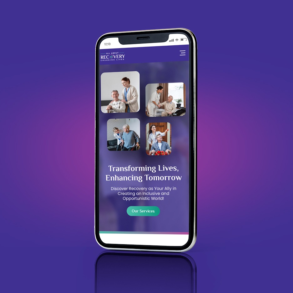
Here’s a non-negotiable fact: mobile now accounts for 62.45% of global internet traffic (desktop 35.71%, tablet 1.84%). Mobile use is goal-oriented and happens in micro-moments—waiting in line, on the couch, during a commute. Users are impatient and context-sensitive, so a clumsy mobile experience feels disrespectful of their time. A critical part of designing a user friendly website is ensuring it works perfectly on small screens. Google uses mobile-first indexing, meaning it primarily evaluates the mobile version of your site for ranking and indexing. That doesn’t happen automatically, design specifically for mobile: keep text readable, make buttons easy to tap, and ensure forms are simple to complete.
4. Fast Loading Speed
Patience is scarce online. According to Google, even a small delay can cost you visitors. A jump from 1 to 3 seconds in load time can make people 32% more likely to leave, and at 5 seconds, the risk of them bouncing shoots up to 90%.
People won’t wait for your site to load. They’ll simply bounce over to a competitor’s site, even if your offer is better. Your load time should be less than two seconds. You can achieve this by compressing images, fixing broken links, and minimizing bulky code.
Speed is a silent ambassador of your user friendly website design. Test regularly with tools like Google PageSpeed Insights and treat every second shaved off as a victory.
Bonus Tips for designing a user friendly website:
While the points above are universal, the user friendliness of a website often depends on the people you’re designing for. The best way to truly understand if your website works well is to ask your audience directly.
Gather Direct Feedback
Instead of guessing what users want, just ask them. Run short surveys, request client feedback, or even conduct quick interviews. You’ll be surprised how small suggestions can make a big difference in user friendliness of a website.
Test Before Finalizing
Tools like A/B testing can help you compare two different layouts or call-to-actions. This way, you’ll know what users actually click on, instead of guessing.
Analyze User Behavior
Look at metrics like time spent on pages, bounce rates, or clicks on navigation. These insights reveal whether users are finding your content easily or struggling to move around.
Adapt to User Expectations
Every business has a different audience. What works for an e-commerce site might not work for a law firm. Designing a user friendly website means tailoring your site’s design, flow, and content to the people you’re serving.
These strategies for designing a user-friendly website can help reduce bounce rates and build greater trust with your visitors.
Still Unsure Where to Start?
If you’ve read through this and are still wondering, “But is my website user friendly?”—we can help.
At Bixel Design, we offer a complimentary website design audit because we believe a website should do more than just look good — it should be functional, intuitive, and easy to navigate. Our team will review your site and share a clear, no-fluff report highlighting its strengths, uncovering areas that may be holding it back, and providing practical recommendations to turn it into a truly user-friendly website. To get your free audit, reach out to us at Bixel Design Contact.
