Intune Psychology is a Sydney-based psychology practice dedicated to helping individuals improve their mental wellbeing through compassionate, evidence-based care. Their work requires a high level of trust, emotional safety, and clarity, as clients often make deeply personal decisions before reaching out for support.
As a practice grounded in empathy and professionalism, Intune Psychology needed a visual identity and online presence that reflected the same calm, confidence, and reassurance they provide in their sessions.
Challenges
Before working with us, Intune Psychology faced several challenges common to growing professional practices:
An outdated, traditional logo and website that no longer reflected the quality or credibility of their services
A visual identity that felt generic and disconnected from the emotional nature of their work
A website that existed online but wasn’t actively guiding, reassuring, or converting visitors
Difficulty making a strong first impression in a space where trust and comfort are critical from the very first interaction.
In a highly sensitive industry like psychology, even small visual and structural gaps can create hesitation, uncertainty, or missed opportunities.
What we have done
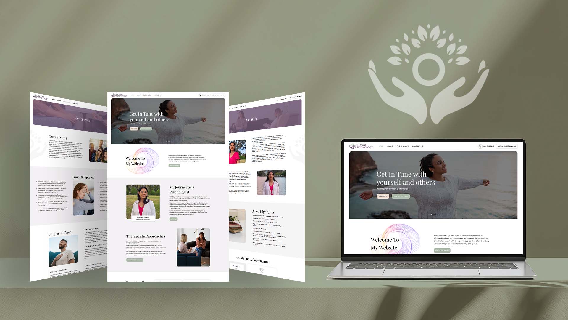
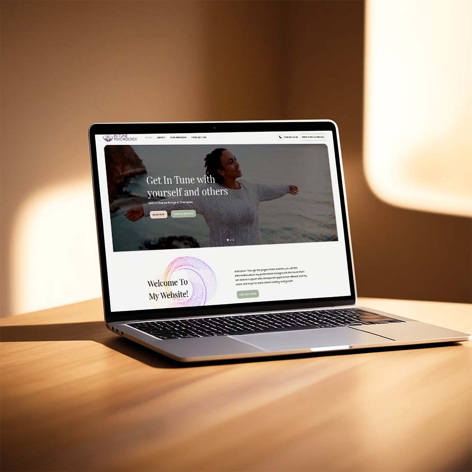
Website Redesign
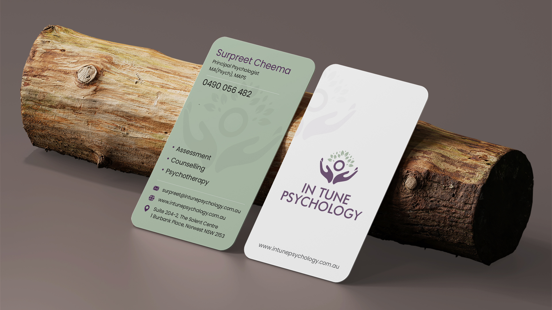
Logo Redesign
Business Card Design
Our Approach & Solution
We approached this project with a human-centered, insight-driven design mindset, focusing not just on how things look, but on how people feel and behave when they interact with the brand.
Our process included:
Discovery & Understanding We took time to understand Intune Psychology’s values, client journey, and the emotional state of someone seeking psychological support.
Brand Refresh with Meaning We redesigned the logo and supporting brand elements to feel calm, professional, warm, and trustworthy — avoiding anything overly clinical or overwhelming.
Website Designed for Clarity & Comfort
The new website was structured to:
Answer key visitor questions within seconds
Reduce cognitive overload
Use clear content hierarchy, whitespace, and gentle visual cues
Create a sense of safety, reassurance, and credibility
Consistent Visual Identity Across Touchpoints, From the business card to the letterhead and website, every element was aligned to create a cohesive and confident brand presence.
The result was a refreshed visual identity and digital experience that feels modern, empathetic, and purposeful, while quietly guiding visitors toward taking action.
Results
Website bookings started coming in soon after launch & within one week of the launch.
Positive feedback received from peers, friends, and professional networks.
Stronger first impressions that reflect trust, professionalism, and emotional sensitivity.
A brand and website that now actively supports the business, rather than just existing online.
Most importantly, the new visual identity helps Intune Psychology connect with people at a critical moment when reassurance, clarity, and trust matter most.