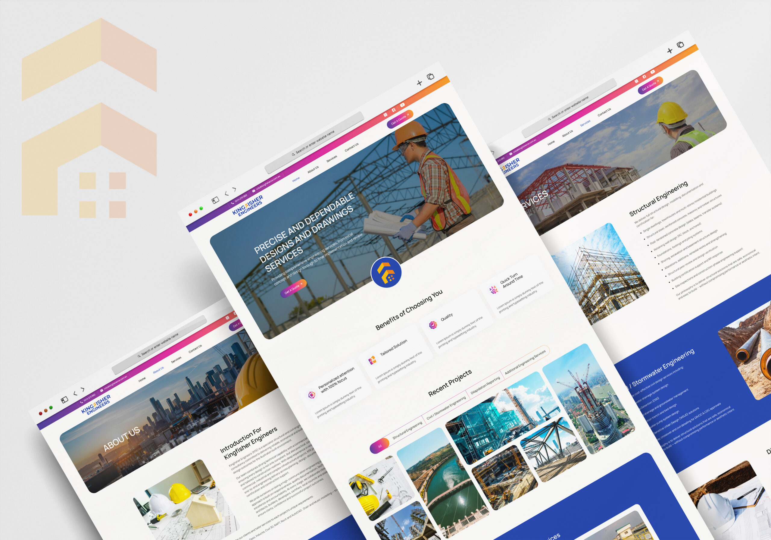
Kingfisher Engineers Brand Refresh
Industry Context
In the engineering sector, credibility isn’t built through words alone; it’s built through clarity, precision, and confidence in presentation.
Today’s clients, developers, and partners evaluate engineering firms long before the first conversation. They assess capability through how clearly services are communicated, how structured the information feels, and how professional the brand appears online.
A dated or inconsistent presence can unintentionally signal inefficiency or lack of scale; even when the expertise is strong. In contrast, a well-structured and modern brand builds instant trust, authority, and reassurance.
About Client
Kingfisher Engineers (KFE) is a specialist structural and civil engineering consultancy committed to delivering reliable, economical and buildable design outcomes for the Australian built environment.
Their work requires precision, attention to detail, and a high level of trust; making it essential for their brand to communicate competence, structure, and professionalism at every touchpoint.
Challenges
Before the refresh, KF Engineers faced several key challenges:
- An outdated visual identity that did not reflect their technical expertise or industry standards
- A website that lacked clarity and structure, making it difficult for visitors to quickly understand their services
- Limited ability to create a strong first impression and build immediate trust
- Inconsistent branding across touchpoints, resulting in a disconnected and less memorable presence
In an industry where decisions are often high-value and risk-sensitive, these gaps can create hesitation; even if the underlying capability is strong.
What we have done
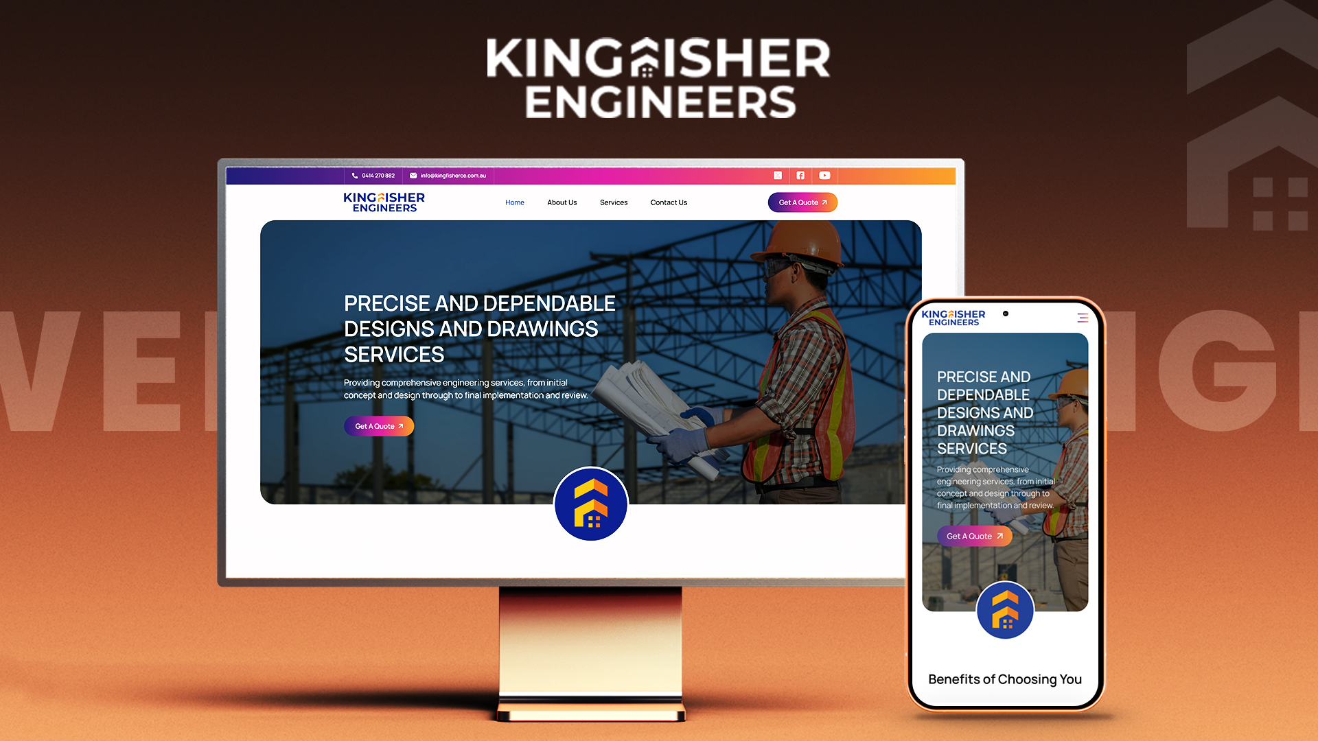
- Website Design
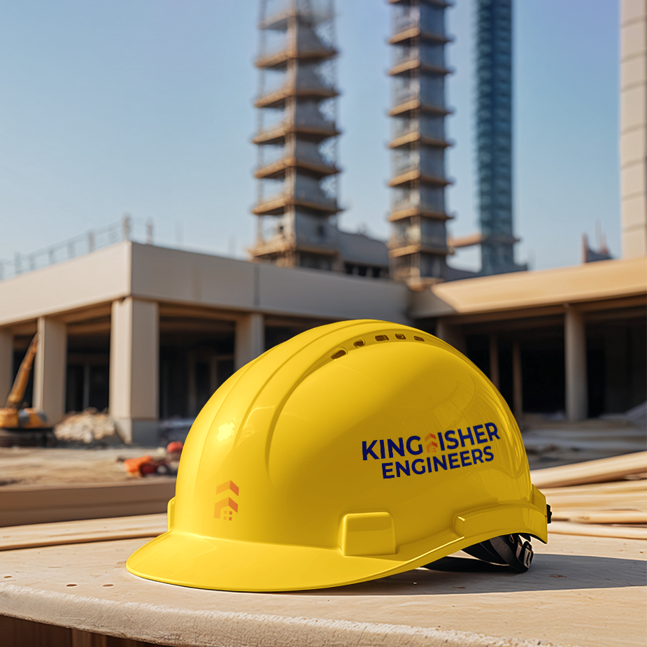
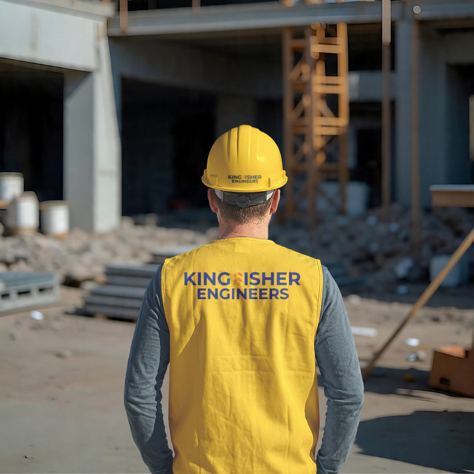
- Logo Design
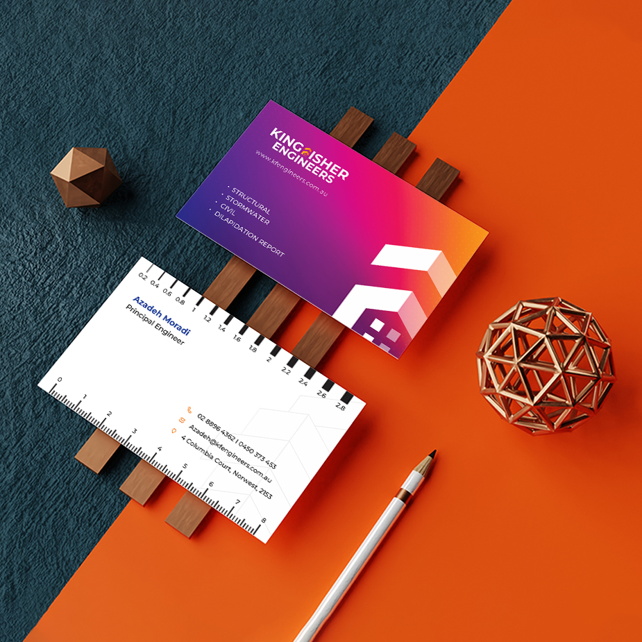
- Business Card Design
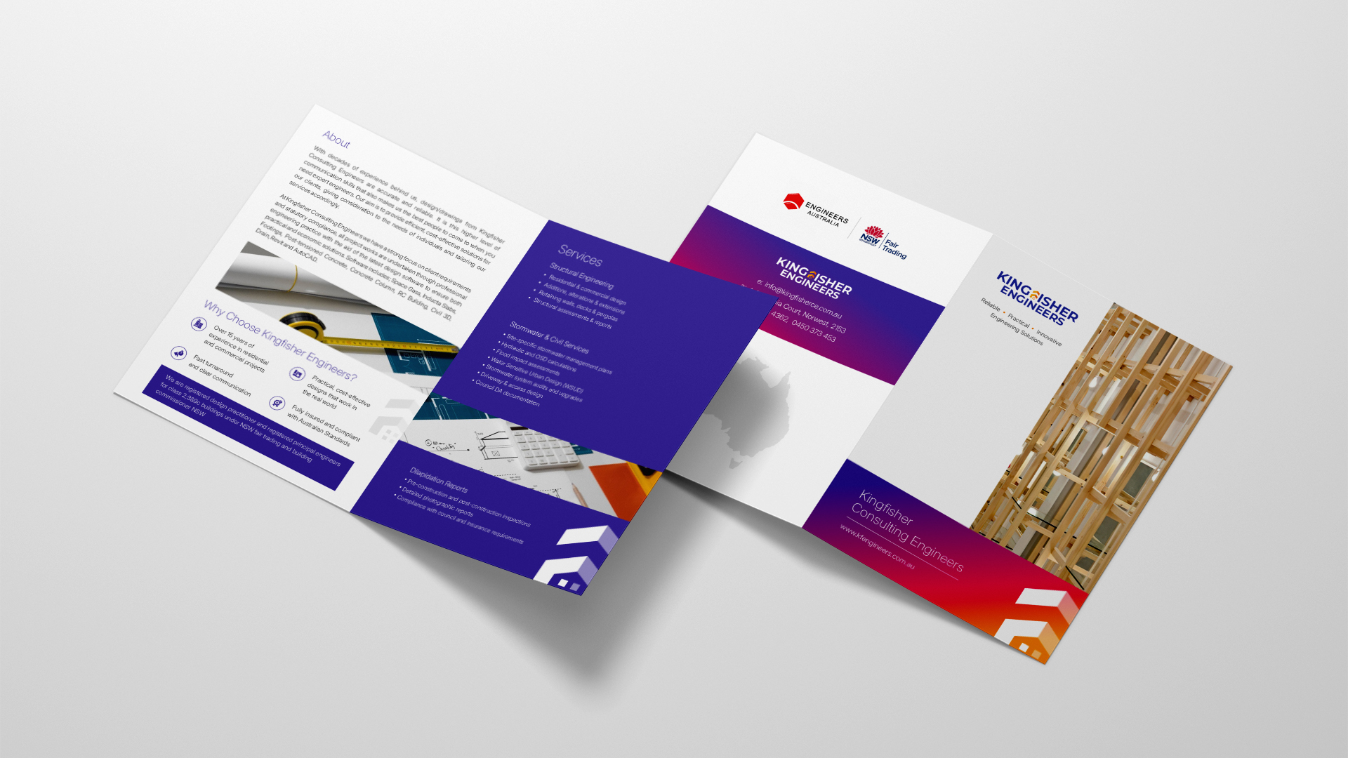
- Flyer Design

Our Approach & Solution
Discovery & Understanding
We worked closely to understand their services, audience, and what builds trust in engineering decision-making.
Brand Refresh with Intent
We redesigned the logo and visual identity to reflect:
- Precision and structure
- Professional credibility
- Modern engineering standards
Website Built for Clarity & Flow
The new website was designed to:
- Clearly communicate services within seconds
- Use structured layouts and visual hierarchy to reduce cognitive effort
- Guide visitors logically through information
- Reinforce expertise through clean, confident presentation
Consistent Identity Across Touchpoints
Business cards and brand assets were aligned to ensure a cohesive and professional experience across both digital and physical interactions.
Every design decision was made to ensure the brand feels clear, reliable, and easy to trust; without overwhelming the user.
Results
- A modern, structured visual identity that reflects technical expertise
- A website that communicates clarity, confidence, and capability instantly
- Improved ability to build trust with potential clients and partners
- A cohesive brand experience across all touchpoints
- KF Engineers now presents itself in a way that matches its engineering precision; helping them create the right perception before the first conversation even begins.
This project demonstrates how thoughtful, structured design can elevate not just how a brand looks; but how it is understood, trusted, and chosen.
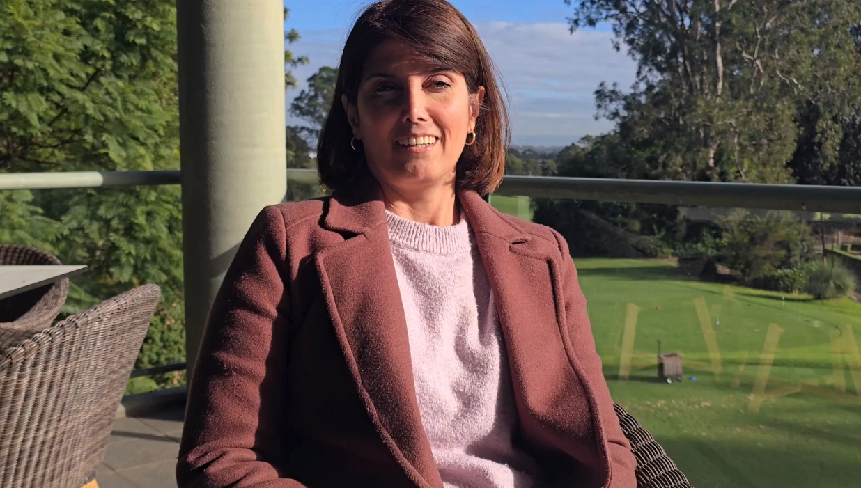
Azadeh Moradi
Principal Engineer, Kingfisher Engineers,
Sydney – Australia