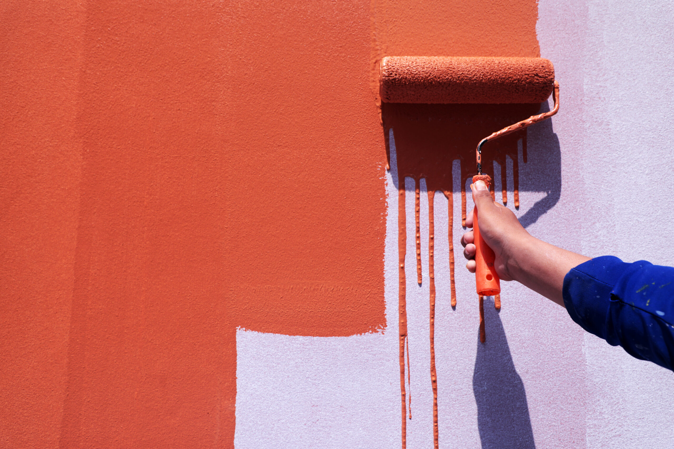
Take a look around. Logos are getting simpler. Websites are breathing more. Brands that once relied on heavy graphics, gradients, and complex visuals are now stripping things back. This is not a coincidence. Minimalist design is taking over branding, and for good reason.
When Jaguar revealed its new brand identity, the internet had opinions. Some were surprised. Some were confused. And many asked the same question. Why would a heritage luxury brand strip its identity down and go minimal?
Jaguar is not alone. Over the past few years, brands like Pepsi, Burberry, Mastercard, Airbnb, Google, and even luxury and automotive brands have simplified their logos, visuals, and overall brand presence. Detailed icons, shadows, gradients, and heavy visual elements are quietly disappearing, replaced by clean typography, simple shapes, and bold spacing.
This shift is not random. It reflects a much deeper change in how people consume content, perceive brands, and make decisions today. Minimalist design is not just a design trend. It is becoming a branding strategy.
What Is Minimalist Design and Why Are Brands Choosing It?
Minimalist design is the practice of removing anything that does not serve a clear purpose. In branding, this means focusing on clarity, functionality, and emotional impact rather than visual excess.
Minimalist branding uses fewer colours, simple typography, clean layouts, and strong spacing. The goal is to communicate a brand’s message quickly and clearly without overwhelming the viewer.
Brands like Jaguar adopted minimalist design to align with modern expectations and future-focused positioning. As brands expand across digital platforms, apps, websites, and social media, they need identities that are flexible, legible, and instantly recognisable.
Minimalism allows brands to be confident without being loud.
The Benefits of Minimalist Design in Branding
1. Reduces Cognitive Load
Cognitive load refers to the amount of mental effort required to process information. When a design is cluttered, the brain has to work harder to understand it.
Minimalist design reduces cognitive load by removing unnecessary elements. This allows the brain to process information faster and with less effort.
According to research published by the Nielsen Norman Group, users prefer simple designs because they are easier to understand and navigate. When users do not have to think too much, they stay longer and engage more.
In branding, lower cognitive load means better user experience and higher trust.
2. Helps the Human Brain Process Information Faster
The human brain processes visuals around 60,000 times faster than text. However, too many visuals can create confusion instead of clarity.
Minimalist design leverages neuro design principles by using fewer, stronger visual cues. This helps the brain quickly identify patterns, hierarchy, and meaning.
Simple layouts with clear focal points guide the user’s eyes naturally. This is why minimalist branding often feels calm, premium, and effortless.
3. Improves Decision-Making

When users are presented with too many choices or too much information, they experience decision fatigue.
Minimalist design reduces this friction. By highlighting only what matters, it makes it easier for users to take action.
This principle aligns with Hick’s Law, a psychological concept that states the more choices a person has, the longer it takes them to make a decision. Minimalist branding limits distractions and focuses attention on key actions, such as signing up, enquiring, or purchasing.
This is especially powerful in websites and landing pages where conversions matter.
4. Builds Trust Through Clarity
From a neuroscience perspective, clarity signals safety. When the brain understands something easily, it feels more comfortable engaging with it.
Clean and structured design subconsciously communicates professionalism and reliability. This is why minimalist brands are often perceived as more trustworthy and premium.
Studies by Google have shown that users form an opinion about a website within 50 milliseconds. Minimalist design helps make that first impression count.
5. Aligns With Neuro Design Principles
Neuro design focuses on how design influences emotions, behaviour, and decision-making.
Minimalist design works well with neuro design because it uses contrast, spacing, alignment, and hierarchy to guide attention. It avoids overstimulation and instead creates focus.
This makes the brand experience more intuitive and emotionally engaging, without overwhelming the user.
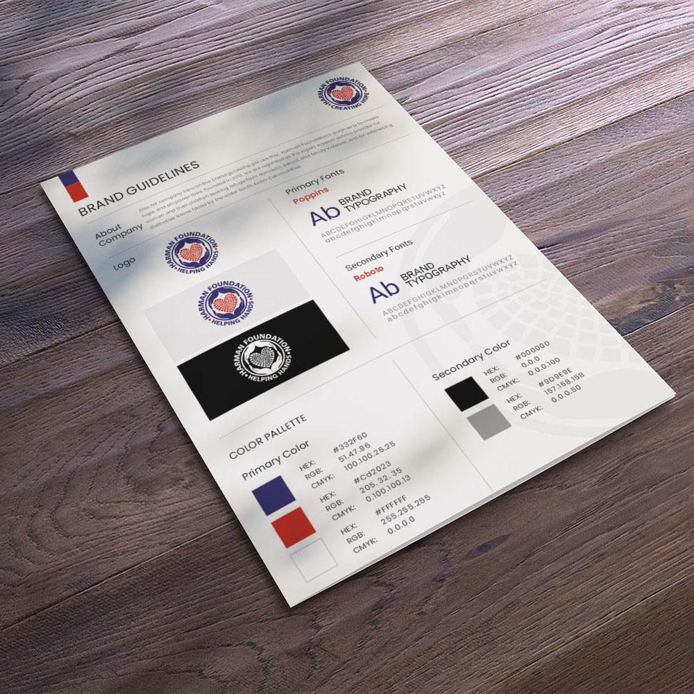
Minimalist Design in Logos
Minimalist logos focus on recognisability, clarity, and scalability.
Instead of relying on detailed illustrations or complex symbols, minimalist logos use simple shapes, clean typography, and strong proportions. This makes them easier for the brain to recognise and remember.
Brands like Mastercard simplified their logo to iconic shapes. Google refined its typography for better legibility. Jaguar’s refreshed identity leans on clean type and a refined visual system that works seamlessly across digital platforms.
From a neuro design perspective, simpler logos are processed faster by the brain. They create stronger memory recall because there is less visual noise to decode.
Minimalist logos also perform better across touchpoints such as mobile apps, social media icons, packaging, and websites, where space is limited.
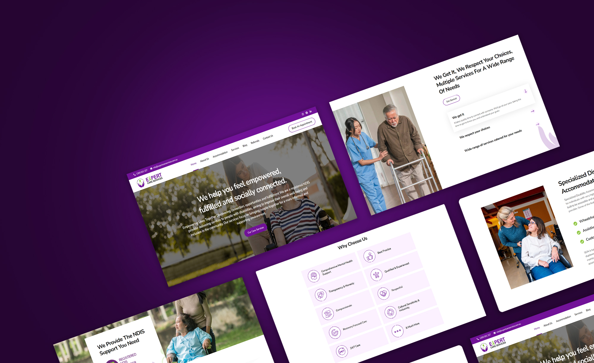
Minimalist Design in Websites
1. Limited Fonts Create Visual Clarity
Minimalist websites typically use only two fonts. One for headings and one for body text. This consistency helps the brain recognise patterns quickly and reduces visual confusion. When users are not distracted by multiple font styles, they can focus on understanding the content instead of decoding the design.
2. A Simple Colour Palette Guides Attention
Minimalist design usually relies on two to three core brand colours. These colours are used intentionally to highlight important elements like call-to-action buttons, links, or key sections. Neutral colours support readability, while accent colours draw attention where it matters most. This makes important information easier to notice and act on.
3. White Space Helps Users Scan and Digest Content Faster
White space, also known as breathing space, is one of the most powerful elements in minimalist web design. Adequate spacing between sections, text, and visuals allows users to scan information quickly and process it with less mental effort. From a neuroscience perspective, white space reduces cognitive load and prevents overstimulation.
4. Clear Hierarchy Makes Key Information Stand Out

Minimalist websites use strong visual hierarchy to guide the user’s eye. Headlines, subheadings, and important messages are highlighted naturally through size, spacing, and contrast. This ensures that key information is easily visible and instantly understood without effort.
5. Clutter-Free Layouts Reduce Distraction
Minimalist websites remove unnecessary elements such as excessive animations, decorative graphics, and overcrowded sections. Every component has a purpose. By eliminating clutter, the website feels calm, focused, and intuitive, encouraging users to stay longer and explore further.
6. Better User Experience Leads to Better Decisions
When a website is simple and easy to navigate, users feel more in control. This sense of control builds trust and makes decision-making easier. Minimalist design reduces friction, improves readability, lowers bounce rates, and increases the likelihood of users taking action.
Recent Examples of Minimalist Branding
Jaguar’s rebrand is one of the most talked-about examples. Pepsi’s refreshed logo feels bold yet simple. Burberry’s clean typography reflects modern luxury. Airbnb’s branding uses simplicity to feel human and welcoming. Apple continues to prove that minimalism and sophistication go hand in hand.
These brands are not removing personality. They are refining it.
When and Why You Should Consider Minimalist Design
Minimalist design is ideal when your brand feels cluttered, outdated, or unclear.
If users struggle to understand your message, minimalism can bring focus. If your website feels overwhelming, simplifying can improve user experience and conversions. If your brand is evolving, a minimalist refresh can signal growth and confidence.
Minimalism works best when it is driven by strategy, not trends.
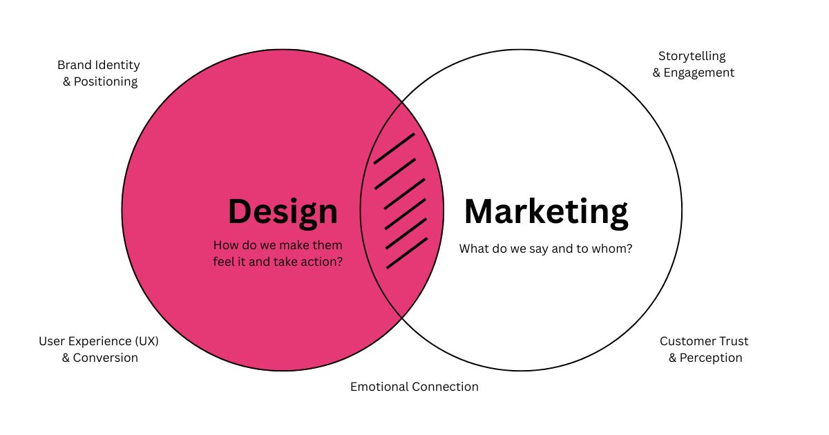
How Bixel Design Can Help
At Bixel Design, we use minimalist design as a strategic tool, not just a visual style.
Our approach combines neuro design principles, brand psychology, and user experience to create identities that are clear, memorable, and emotionally engaging.
Whether it is a logo refresh, a modern user friendly website design, or a full brand transformation, we focus on reducing noise and amplifying what truly matters.
Minimalist design is not about doing less. It is about designing with intention.
Contact us on: divya@bixeldesign.com.au or check our website Bixel design.