There is a version of this conversation that has been happening in boardrooms and briefs for the better part of two decades. Someone brings up the website. Someone else mentions the app. A decision is made to invest in making things look better or work faster, and the project is handed to a team or an agency without a clear articulation of what success actually looks like. The result is a product that is technically functional but commercially underwhelming. Leads do not convert. Users drop off. The business cannot quite explain why.The explanation, in most cases, begins with a misunderstanding of user interface and user experience design. Not a misunderstanding of the terminology, but of what these disciplines actually do for a business and why the distinction between them matters. In 2026, with digital competition at its most intense and user expectations at their highest, getting this right is no longer a creative consideration. It is a commercial one.
User Interface and User Experience Design: Two Disciplines, One Strategic Purpose

The question of what ui and ux design actually means is one of the most searched and most poorly answered in the digital industry. The confusion is understandable. The terms are used interchangeably in job titles, agency offerings, and project briefs. But they describe genuinely different things, and conflating them produces genuinely different problems.
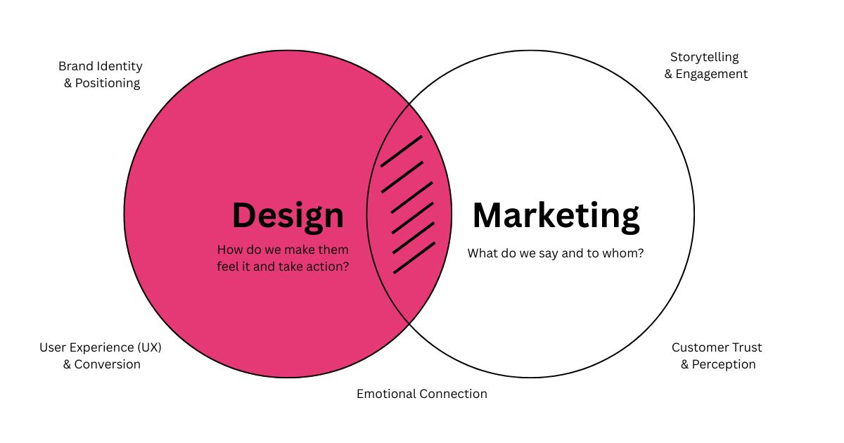
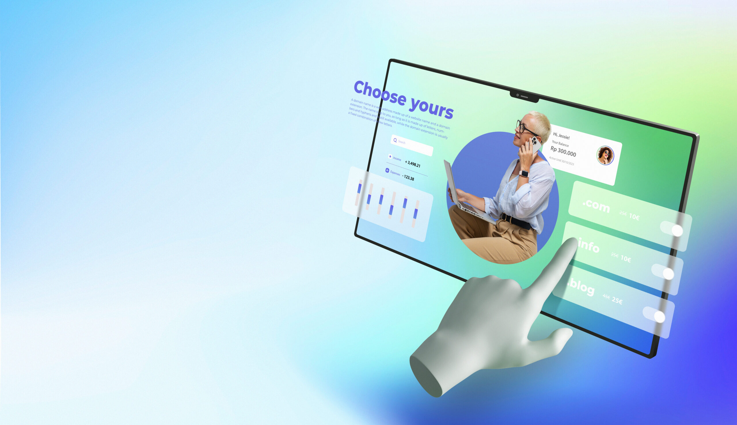
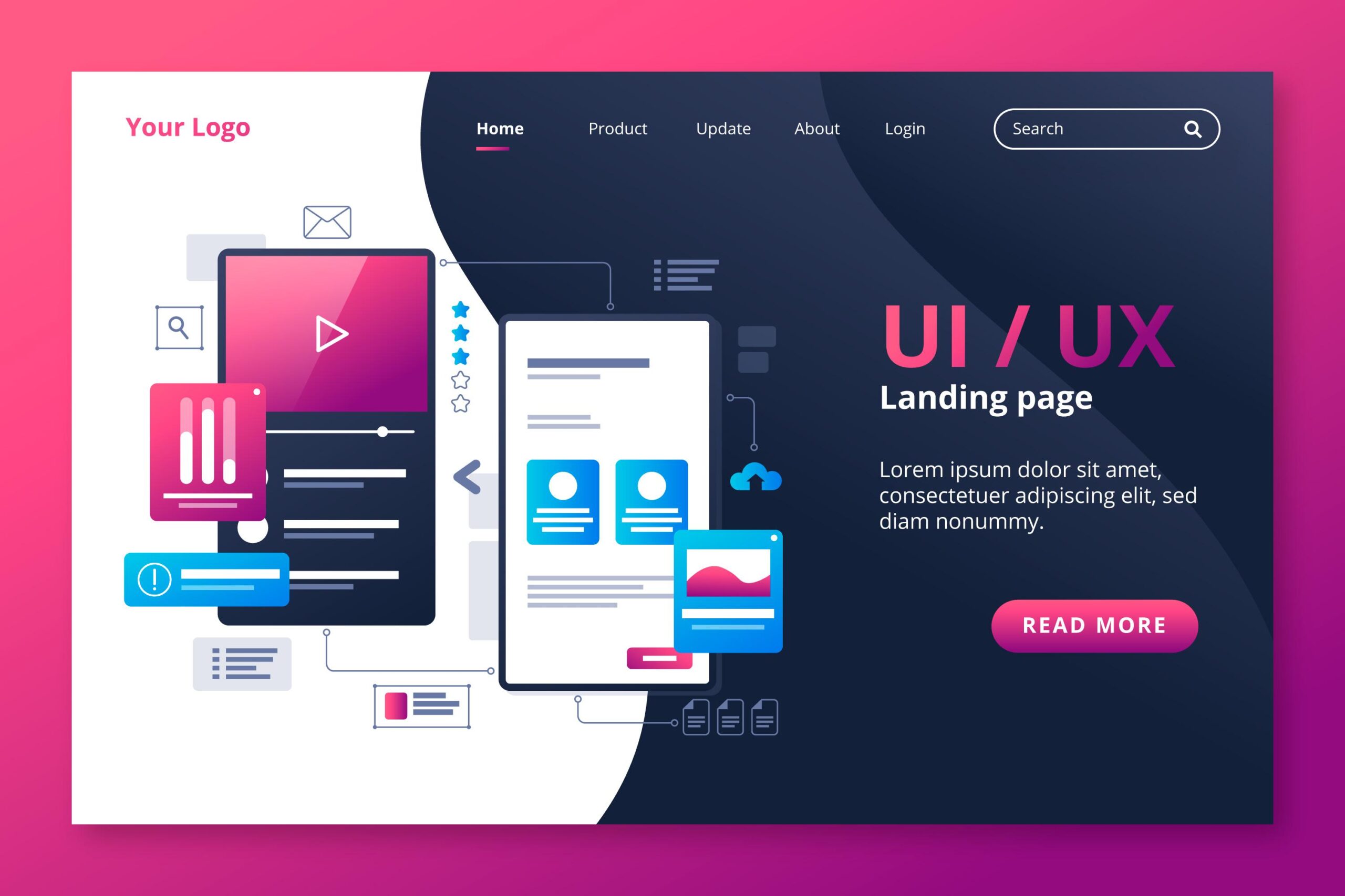
User experience design, commonly referred to as ux design, concerns itself with the totality of how a person feels when they interact with a product, service, or system. It is the discipline of understanding what a user is trying to accomplish, mapping the journey they need to take to accomplish it, and removing every point of friction that stands between intention and outcome. UX design is largely invisible when it is done well. The user does not notice the logic behind the navigation or the research informing the page structure. They simply find what they need and do what they came to do.
User interface design, or user interface design, is the visual and interactive layer built on top of that experience architecture. It is the typography, the colour system, the button states, the spacing, the micro-interactions, and every other visual element a user sees and touches. Interface design translates the experience logic into a tangible surface. It is responsible for the immediate aesthetic impression a product makes and for the moment-to-moment clarity with which a user can navigate it.
The strategic purpose of user interface and user experience design taken together is to ensure that every interaction a person has with a digital product moves them closer to a decision, a conversion, a completed task, or a deepened relationship with the business behind it. One without the other produces a product that either looks right but confuses users, or flows logically but fails to build confidence.
A well-designed interface sitting on a poorly considered experience is a beautiful building with no doors. People can admire it. They cannot get in.
The Psychology of Interaction: Why Design Is Never Just Visual
Understanding why ui and ux has such a measurable impact on commercial outcomes requires a brief detour into cognitive psychology. The human brain does not evaluate digital products objectively. It evaluates them through a set of deeply ingrained cognitive shortcuts that were developed long before the internet existed.
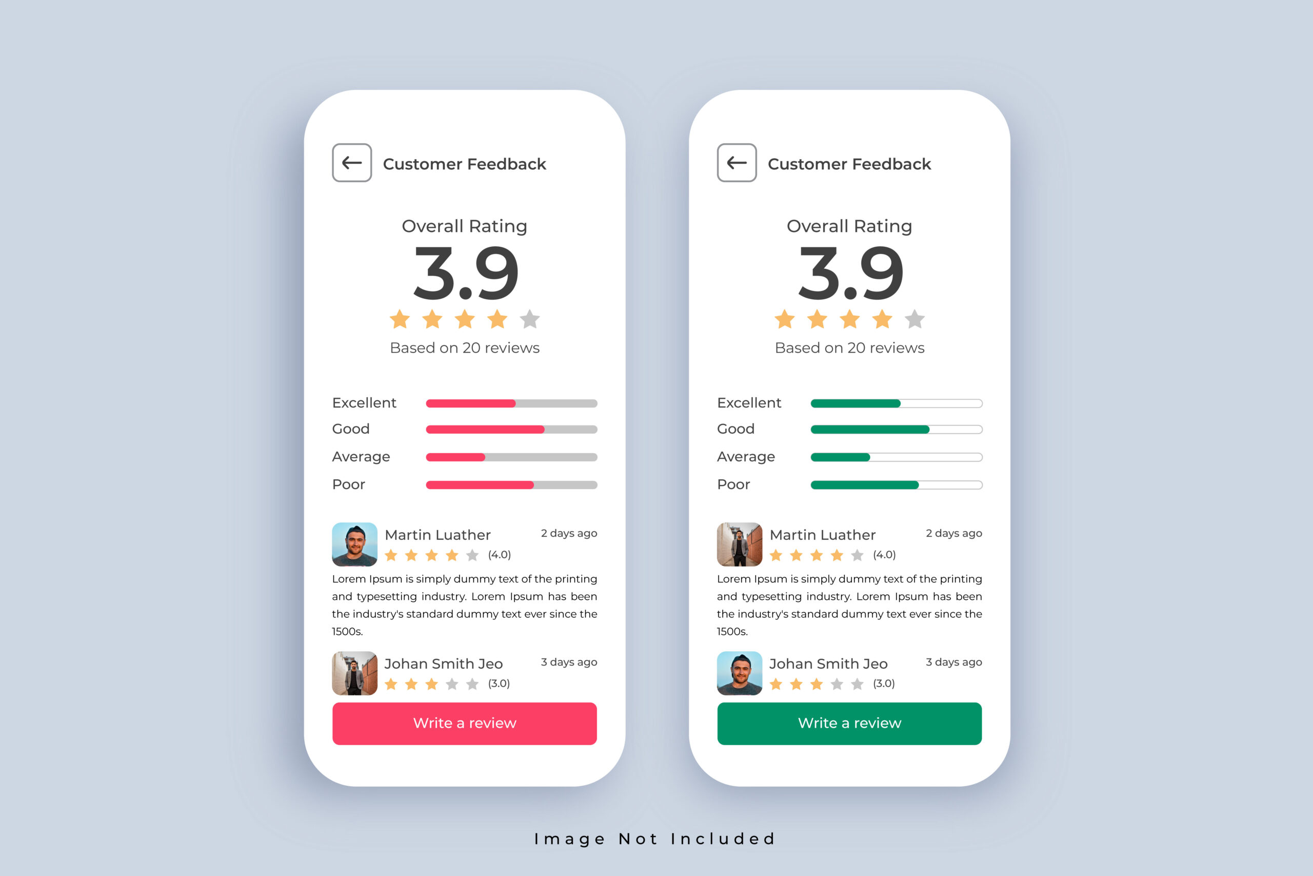
The first of these is what psychologists call the aesthetic-usability effect. Research by Masaaki Kurosu and Kaori Kashimura established that users consistently perceive visually appealing interfaces as easier to use, even when they are not. This has a direct implication for interface design: the visual quality of a product is not separate from its perceived functionality. It is part of it. A healthcare platform that looks dated will be experienced as more difficult to use than a visually refined platform with identical underlying functionality. The design is the credibility.
The second mechanism is Hick’s Law, which describes the relationship between the number of choices presented to a user and the time it takes them to make a decision. Every additional option, navigation item, or call to action on a screen increases cognitive load and slows or prevents decision-making. This is why experienced ux design ui design practitioners spend as much time removing elements as they do adding them. Restraint is not a stylistic preference. It is a conversion strategy grounded in how the brain actually processes choice.
The third is the peak-end rule, identified by Nobel laureate Daniel Kahneman. Users do not evaluate an experience by averaging every moment within it. They judge it by its most emotionally significant moment and its final moment. For a business investing in user experience design, this means that the quality of the onboarding experience and the quality of the checkout or conversion moment carry disproportionate weight in how the product is remembered and whether the user returns.
Users do not remember every screen. They remember how the hardest moment felt and how the last moment felt. Design both with intention.
User Interface vs User Experience Design: Key Differences in Real-World Applications

The ui vs ux distinction is perhaps best illustrated through a practical scenario. Consider a wealth management firm that has built a client portal for reviewing investment portfolios. The portal has been designed by a capable visual designer. The colours are on brand. The typography is clean. The dashboard looks impressive at first glance.
And yet clients are not logging in. Support calls about how to find basic account information are frequent. The firm’s relationship managers are spending time on the phone walking clients through tasks the portal was built to handle independently. The interface is attractive. The experience is broken.
A ui ux designer approaching this problem would begin not with the visual layer but with the user. What does a client actually need to do when they log in? In what order do those needs arise? What information creates anxiety if it is missing or hard to locate? What language does the client use when they think about their portfolio, and does the interface reflect that language or impose the firm’s internal terminology instead? The answers to those questions produce the experience architecture. The interface design follows from that.
This sequencing is one of the most important and most commonly reversed decisions in digital product development. Businesses that begin with how something looks and then try to map function onto that surface consistently produce products that are visually coherent but experientially frustrating. Businesses that begin with how something needs to work and then build a visual language to serve that function produce products that users actually use.
Why 2026 Has Raised the Stakes
There are several converging forces that make user interface and user experience design more commercially consequential in 2026 than at any previous point.
The first is the normalisation of excellence. Users in 2026 have been shaped by daily interaction with products built by the most well-resourced design teams in the world. Their expectations are calibrated accordingly. A financial services business competing for clients online is not being compared only to other financial services businesses. It is being compared to every digital experience the prospective client has had today. The bar is not set by the industry. It is set by the best product the user touched before they arrived at yours.
The second force is the acceleration of decision-making. Research consistently shows that the window in which a user decides whether to stay or leave a digital product has narrowed over time. A confusing navigation, a slow-loading page, or a form that asks for more information than the user is willing to give at that stage of the relationship will end the interaction immediately. There is no patience budget left. The cost of a poor user experience is measured not in complaints but in exits, and most businesses never see those exits for what they are.
The third is the proliferation of touchpoints. In 2026, the user interface a business presents extends beyond its website to include mobile applications, AI-assisted tools, client portals, interactive proposals, and digital onboarding flows. Each one is a surface where the quality of design either builds or undermines the relationship. Managing that consistency and quality across every touchpoint requires a strategic investment in uxui that goes well beyond a single project or a single platform.
What Businesses Actually Get Wrong
The most common mistake businesses make with ui and ux design is treating it as a finishing step rather than a foundational one. Design is brought in at the end of a development process to make things look presentable, rather than at the beginning to define how things should work. The result is a product whose functionality has been determined by technical constraints and internal assumptions rather than by the actual needs and behaviours of the people who will use it.
The second mistake is measuring the wrong thing. Businesses evaluate their digital products by whether they work, meaning whether they are technically functional, rather than by whether they perform, meaning whether they drive the behaviours and outcomes the business needs. A website that loads correctly but does not convert is not a working website. It is a failing one. The standard for success must be set at the level of commercial outcome, not technical delivery.
The third mistake is underestimating the relationship between design quality and brand perception. Every interaction a user has with a digital product is an interaction with the brand behind it. A poorly designed portal from a consulting firm communicates something about the firm’s standards, its attention to detail, and the quality of the work it delivers to clients. It may communicate this unfairly. But it communicates it nonetheless, and in an environment where trust is built through accumulated impressions, that communication has consequences.
Poor design does not just frustrate users. It quietly convinces them that the business behind it is not worth their time or their money.
Choosing the Right Partner in Sydney and Beyond
For businesses in Australia looking to invest seriously in UI UX design service, the choice of partner matters considerably more than most briefs acknowledge. The difference between an agency that produces visually polished work and one that produces strategically grounded work is the difference between a product that looks right and one that performs.
A credible user experience design agency will begin every engagement with research: into the users, into the competitive landscape, into the specific friction points that are currently costing the business leads or retention. They will produce experience architecture before interface designs. They will test assumptions rather than present them as conclusions. And they will measure success in commercial terms, not creative ones.
For businesses specifically seeking a UI UX design agency Sydney-based team that understands the local market and the expectations of Australian users, the strategic layer matters as much as the craft. Sydney’s competitive professional services environment demands digital products that not only meet the functional expectations of users but actively build the confidence and trust that convert a visitor into a client.
Working with a ui ux design agency that applies behavioural science and Neuro Design principles to every project means that the decisions governing the product are not based on aesthetic preference or industry convention. They are based on how the target user actually thinks, decides, and behaves. That difference is measurable. It shows up in conversion rates, in retention figures, and in the quality of the client relationships the product helps to build.
The Questions Worth Asking Before You Invest in UI-UX Services
Before commissioning any user interface and user experience design project, there are a small number of questions that will determine whether the investment produces a commercially meaningful outcome or an aesthetically pleasing one.
- Has the project brief been defined in terms of user outcomes and business outcomes, or in terms of deliverables and aesthetics?
- Is user research informing the design decisions, or are internal assumptions being treated as sufficient?
- Is the agency or team starting from the experience architecture before touching the interface layer?
- How will success be measured, and is that measure tied to conversion, retention, or another commercial outcome?
- Does the proposed approach account for the full range of touchpoints a user will encounter, or only the primary platform?
The answers to these questions will tell you more about the likely quality of the outcome than any portfolio or case study. They will also tell you whether the business thinking behind the brief is as strong as the creative brief itself. In most cases, the projects that underperform do so not because the design was poor but because the strategy informing it was absent.
The New Standard for User Interface and User Experience Design in 2026
In 2026, user interface and user experience design are not differentiators for businesses that invest in them. They are table stakes. The question is no longer whether to take these disciplines seriously. The question is whether the investment is being made strategically enough to produce the commercial outcomes the business needs.
The businesses that are winning in competitive digital environments are those that understand design not as a layer applied to a product but as the product itself. Every screen, every interaction, every moment of friction or fluency is either building the case for the business or undermining it. There is no neutral design decision.
If you are ready to approach user experience agency investment with the strategic rigour it deserves, we would be glad to consult with our team today and walk you through what a research-led, conversion-focused design process looks like in practice.
Contact us to gain more clarity on your challenges and the right solutions. We will audit your brand, consult with you, and explain the psychology behind what is working and what is not. If you still have questions, you can explore our other blogs and case studies – everything we share is built to solve the real challenges faced by small to medium-sized businesses and support their growth with confidence.
Contact Bixel Design
🌐 Website: https://bixeldesign.com.au/
📧 Email: divya@bixeldesign.com.au