As title suggest there are two ways to see this picture. Businesses design home page based on either one of this two factor. One is how they like and the other one how user feel it. And guess what
Most businesses assume their website is doing its job. Traffic comes in, the design looks polished, and the enquiry form is easy enough to find. Yet the leads are not converting at the rate they should. The problem is rarely the product and rarely the traffic. The problem is almost always the homepage itself.
Building a high converting home page requires more than good design instincts. It requires an understanding of how the human brain behaves when it first lands on an unfamiliar website: sceptical, impatient, and hungry for a reason to stay. Most homepages fail that test within the first few seconds. This piece unpacks why that happens, what the psychology tells us, and how to build a homepage that earns trust and drives action.
Why Most Homepages Fail Before They Get a Fair Chance
The challenge with homepage conversion is that it is invisible. Unlike a broken form or a missing product page, a homepage that fails to convert does not throw an error. Visitors simply leave, and most businesses have no idea why.
The psychology behind this is well documented. When a person lands on a website, their brain is running what researchers call a cognitive fluency check. In plain terms, it is asking: how easy is this to understand? The less mental effort required to grasp what a business does, who it is for, and why it matters, the more trustworthy and credible the site feels. When that check fails, which it does on most service business websites, the brain reaches for the easiest available decision. It leaves.
This is the core challenge of home page design. It is not a visual problem. It is a cognitive one. The visual design is the delivery vehicle. What it needs to deliver is clarity, confidence, and direction, in that order, and it needs to deliver all three before the visitor has formed a conscious opinion about whether to stay.
Visitors do not read homepages. They scan them for signals that tell them whether this business is worth their attention.
The Five Structural Elements of a High-Converting Homepage
Let us work through the anatomy precisely. Each element has a specific job to do, and failing at any one of them will cost you leads regardless of how well the others perform.
Let’s start with the homepage’s first section – “The Hero Section“. It should include three key elements. Let’s explore what works, what doesn’t, with examples.
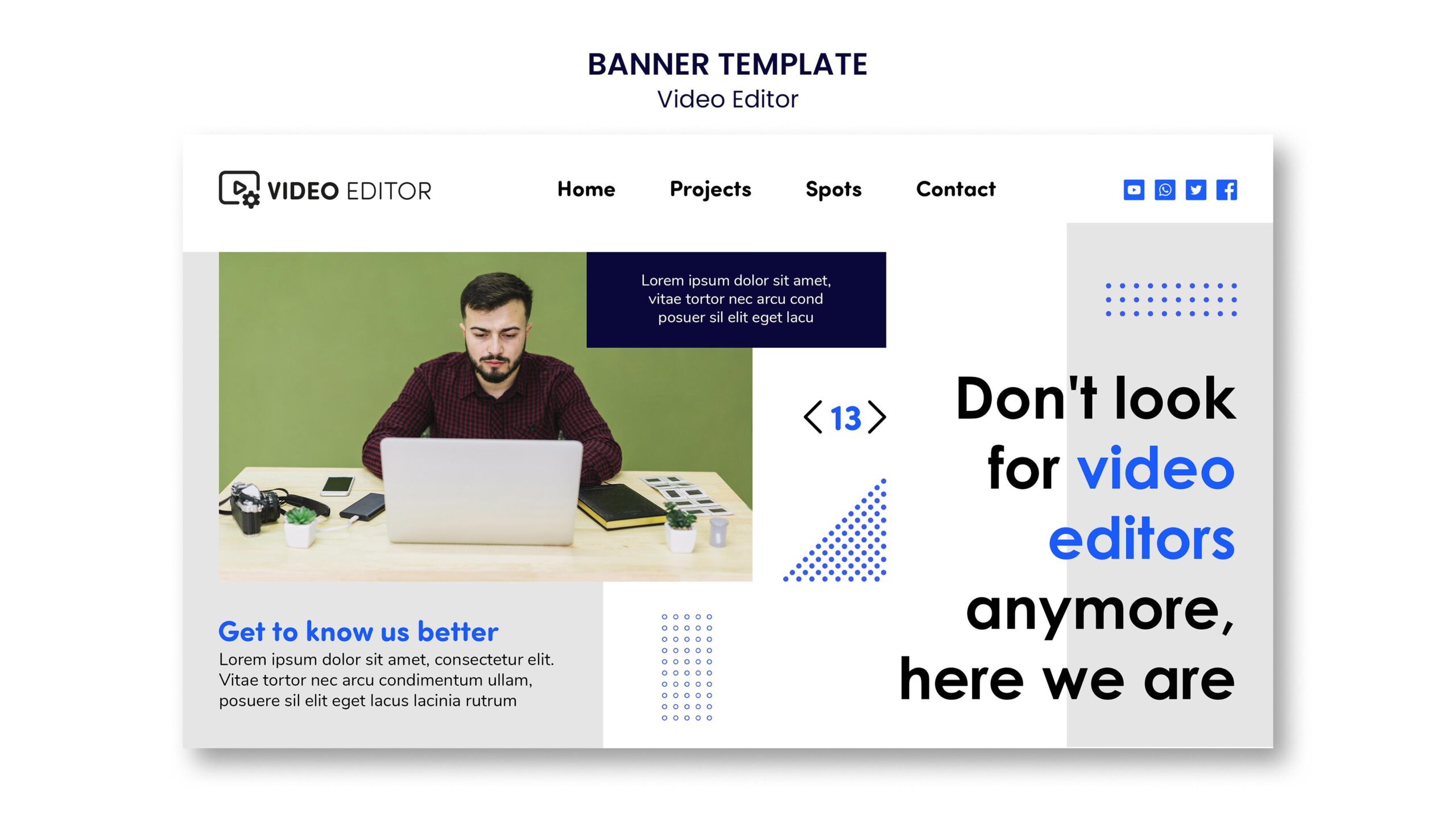
1. A Clear Headline in The Hero Section of The Homepage
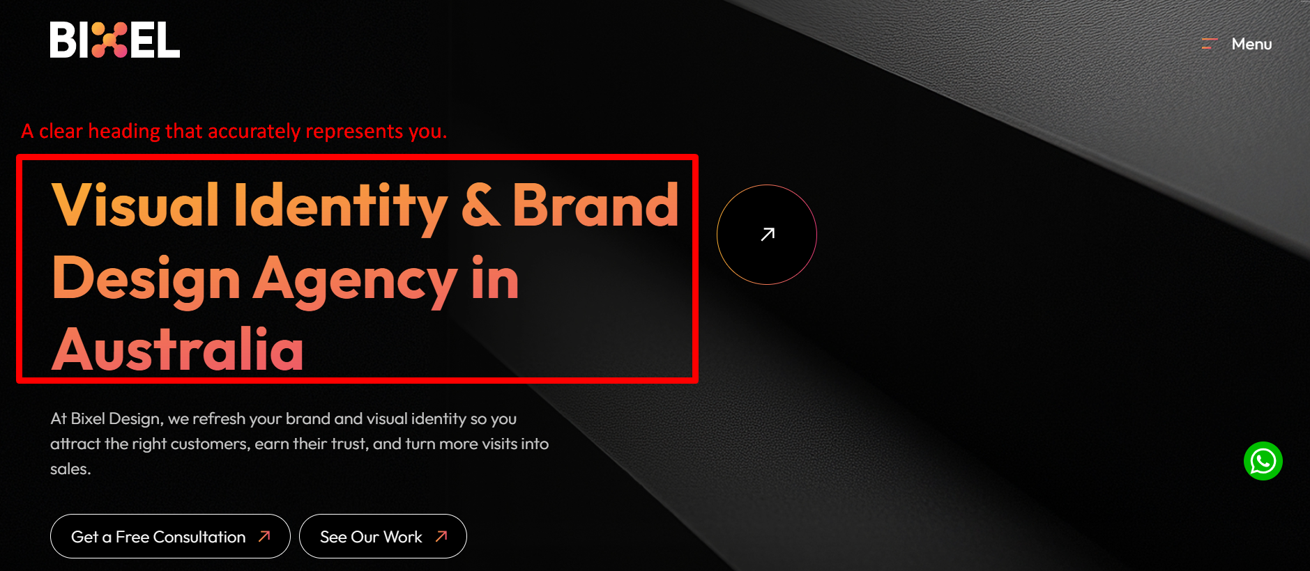
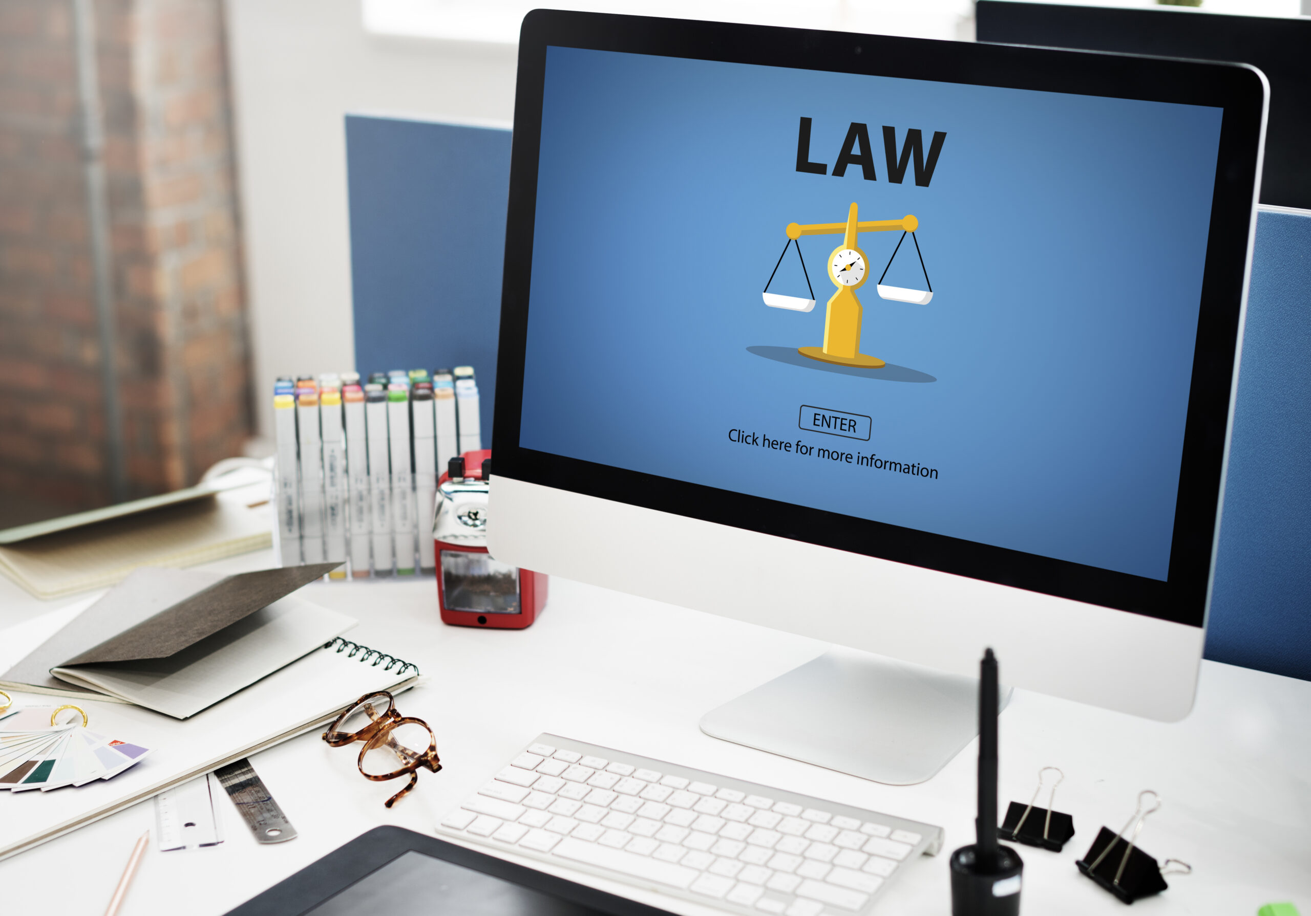
Consider a professional services firm in the legal sector. A typical headline of hero section of the homepage might read: ‘Experienced Commercial Lawyers, Sydney.’ It describes the business accurately. It does nothing for the visitor. The visitor already knows they are looking at a law firm. What they do not yet know is why this one is the right choice for them.
A high converting home page opens with a headline that addresses the visitor’s situation, not the business’s credentials. Something closer to: ‘Commercial Legal Advice That Protects Your Business and Your Time.’ The shift is subtle, but the psychological impact is significant. The first version talks at the visitor. The second talks to them.
The neuroscience here is relevant. The brain’s threat-detection system, the amygdala, is active even during low-stakes browsing. A headline that speaks directly to a known frustration or desired outcome deactivates that scepticism faster than any amount of credentials or social proof. Lead with empathy before you lead with expertise.
2. A Subheadline That Earns Specificity in The Hero Section of the Homepage
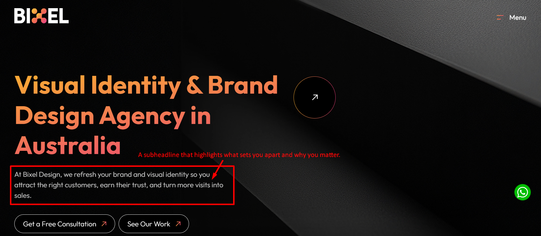
Once the headline holds attention in the hero section, the subheadline’s job is to be specific enough to create genuine relevance. This is where many businesses either over-explain, turning it into a second paragraph, or under-deliver with vague phrases like ‘full-service solutions for your needs.’
For a business offering web design as a service, the subheadline is the right place to introduce what makes the approach different, who specifically benefits, and what the outcome looks like. One or two sentences, no more. The goal is not to close the visitor here. It is to give them enough to want to keep reading.
Specificity builds trust in a way that generalisation never can. When a visitor reads a subheadline and thinks ‘that sounds exactly like my situation’, you have moved from being one of many options to being a credible candidate. That shift happens in the subheadline or it does not happen at all.
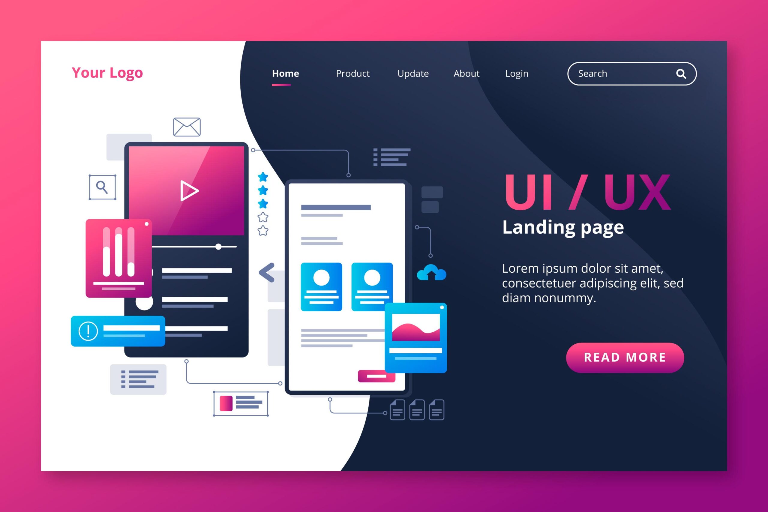
3. Friction-Free Call to Action in The Hero Section of the Homepage
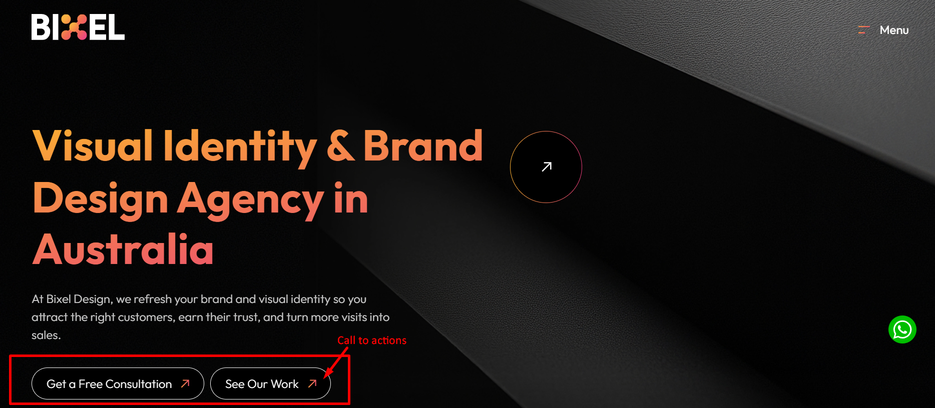
Most homepages we audit have too many calls to action and too little conviction behind any of them. There is a ‘Book a Call’ button, a ‘See Our Work’ link, a ‘Learn More’ buried in the navigation, and a newsletter signup in the footer. Each one competes with the others and the visitor, unable to identify the intended next step, defaults to doing nothing.
The psychology is straightforward. Barry Schwartz’s research on the paradox of choice demonstrated that more options do not produce more action. They produce paralysis. A high converting home page presents one or two dominant call to action at the top of the page (in the hero section), stated clearly, with language that tells the visitor what they will get rather than what they must do. ‘Consult with our team today’ outperforms ‘Contact Us’ because it implies a conversation, not a transaction.
Clarity is a conversion strategy. The more clearly a visitor understands their next step, the more likely they are to take it.
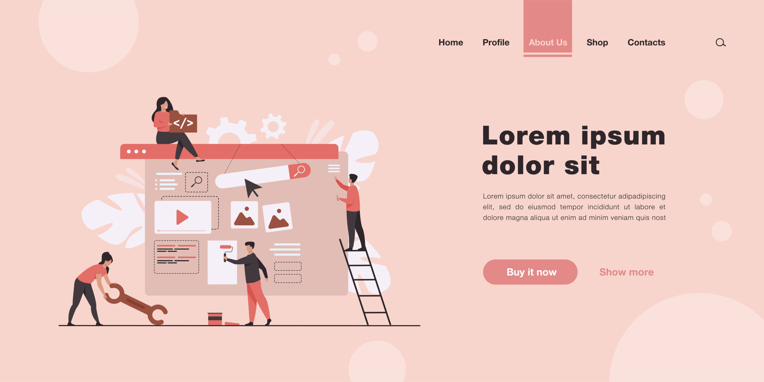
4. A Visual Layer That Confirms, Not Just Decorates
The visual component of your homepage carries enormous psychological weight, particularly in the first moments of a visit. Research on the halo effect tells us that a single positive impression in one area, in this case the visual quality of a site, transfers to unrelated judgements like credibility, expertise, and trustworthiness.
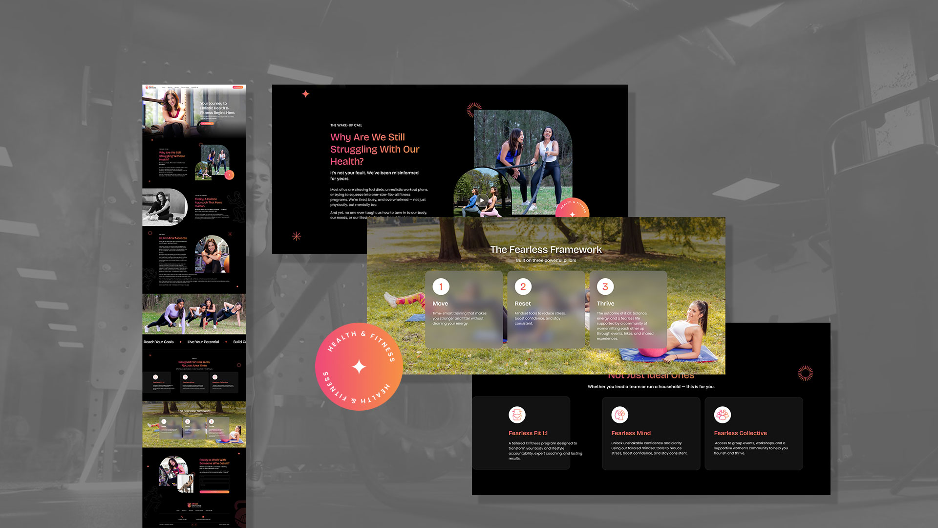
For a business in the professional services space, whether that is accounting, consulting, or web design as a service, the visual layer should do one thing above all else: confirm the quality of what is being offered. Generic stock photography undermines this because the brain processes authenticity very quickly. Real client environments, real team members, and real deliverable samples outperform staged imagery in almost every conversion scenario we have observed.
The visual and the headline must also function as a unified message. When they tell different stories, the visitor’s brain registers the inconsistency even if they cannot articulate it, and trust erodes before a single word of copy has been absorbed.
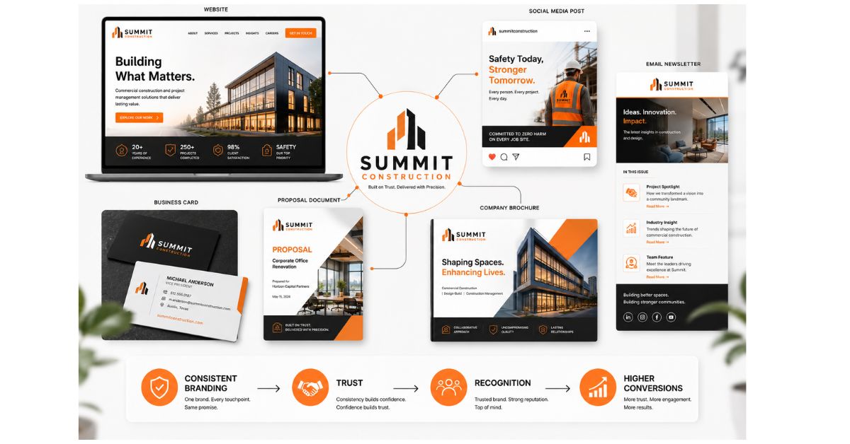
5. Trust Signals That Answer the Unasked Question
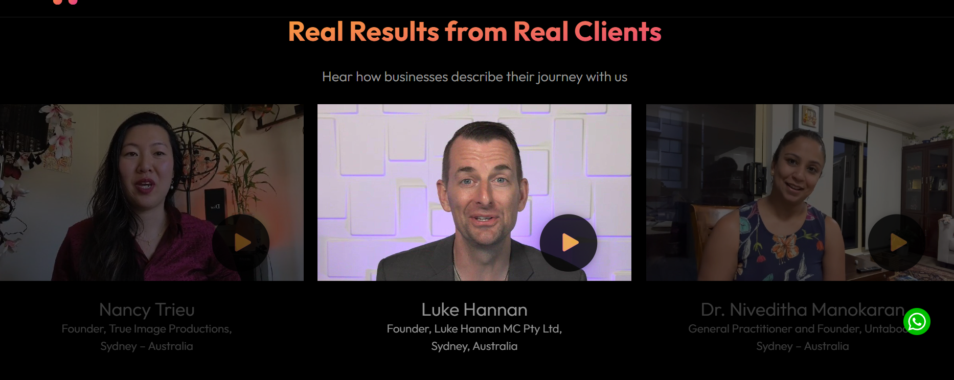
Every visitor to your homepage is carrying a silent question: ‘How do I know I can trust this business?’ Most businesses either ignore this question or answer it with signals so generic they carry no weight. ‘Trusted by hundreds of clients’ tells the visitor nothing. It does not activate trust. It activates scepticism.
Effective trust signals on a high converting home page are specific, third-party, and tied to outcomes. Named client logos from recognisable organisations. A testimonial that references a concrete result rather than a vague experience. An award from a credible industry body. A media mention that provides external validation. Each of these answers the unasked question with evidence rather than assertion.
The placement matters too. Trust signals work hardest when they appear directly after your primary headline and call to action, not buried three scrolls down the page. By then, most visitors have already decided.
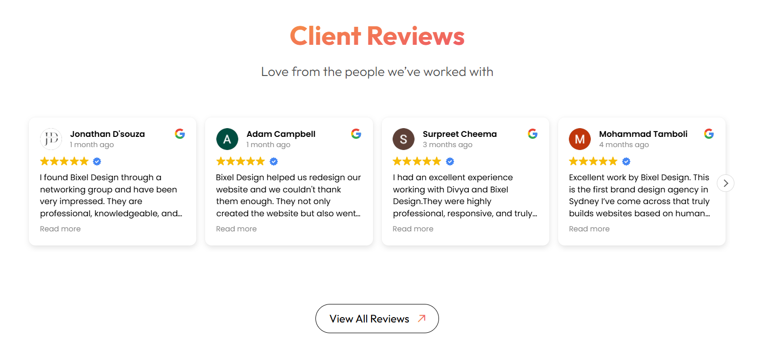
The images above show strong examples, including video testimonials and Google reviews. People trust people, and seeing real clients speak about their experience makes the proof far more believable. This kind of social proof, whether testimonials, awards, or key milestones, helps build genuine trust.
The Deeper Challenge: Cognitive Load and Conversion
One of the most underappreciated challenges in home page design is cognitive load, which is the total mental effort a visitor has to expend in order to understand your site and decide what to do next. Every element on your homepage either reduces that load or adds to it.
Dense copy adds load. Multiple competing CTAs add load. Jargon adds load. An unclear value proposition adds load. A navigation menu with twelve items adds load. Each addition seems minor in isolation, but they compound. By the time a visitor reaches the end of an overloaded homepage, they are mentally exhausted, and mentally exhausted people do not make enquiries. They close tabs.
The businesses with the strongest homepage conversion rate share a common trait: ruthless editorial restraint. They have made hard decisions about what to remove as much as what to include. Every element on the page has been earned. Nothing is there for the sake of completeness or internal politics.
A homepage is not a complete picture of your business. It is a carefully edited argument for why the visitor should take the next step.
What the Self-Audit Reveals
Before investing in a redesign or a complete rebuild, the most useful thing most businesses can do is run an honest self-audit. Open your homepage on a device you do not use every day. Give it ten seconds. Then ask:
• Is it immediately obvious what this business does and who it serves?
• Is there one clear action being communicated?
• Does the visual quality reflect the calibre of the work or service being offered?
• Is there at least one specific, credible reason to trust this business?
• Does the copy talk to the visitor’s situation, or does it talk about the business?
Most businesses find that two or three of those questions produce an uncomfortable answer. That discomfort is valuable. It tells you exactly where your high converting home page is losing leads, and it gives you a clear starting point for what to fix first.
Why Homepage Design Tips Alone Are Not Enough
There is no shortage of homepage design tips online. However, most of them miss the strategy behind the design decisions. A homepage is not just a collection of separate sections. It is a structured message, and every message follows a certain logic.
A high-performing homepage follows a clear psychological flow. It starts with orientation, helping visitors understand who the business is for and what they will get. It then builds credibility by showing proof that the business can deliver. Next, it addresses hesitation by answering common doubts and concerns. Finally, it leads to a clear and simple next step for the visitor.
When this sequence is broken – for example, when credibility comes before clarity, or when a call to action appears before trust is built, the page stops converting. This does not happen because the individual elements are weak, but because the overall structure is not working.
This is what Neuro Design focuses on at its core. It is not just about how a page looks, but about how it makes a visitor feel, think, and decide. Applying these principles to any website design is not just a creative task, it is a strategic one.
Conclusion
A high-converting homepage is not created by good design taste alone. It comes from understanding your visitor’s psychology, using a clear structure to guide them toward a decision, and removing anything that creates confusion.
If your homepage is not generating the enquiries your business deserves, the answer is rarely a new colour palette or a different hero image. It is a rethinking of the architecture. Start with the strategy. Let the design follow from that.
If you are facing similar challenges or still unsure about your homepage, we can help. You can get your website audited or consult with our team today and show you what a conversion-led approach could mean for your business.
Contact Bixel Design
🌐 Website: https://bixeldesign.com.au/contact/
📧 Email: divya@bixeldesign.com.au