Jaguar stripped its identity back. Pepsi simplified its logo. Burberry moved to clean typography. Airbnb replaced visual complexity with breathing space. These are not isolated decisions made by bored creative directors. They are responses to the same underlying shift in how people consume, process, and respond to brands in a saturated digital environment.
The rise of minimalist branding is not a design trend in the conventional sense. It is a strategic response to cognitive science. Brands are not simplifying because simplicity is fashionable. They are simplifying because simplicity converts, retains attention, and builds trust in ways that visual complexity cannot.
If your brand still relies on heavy graphics, gradients, layered visuals, or a logo that requires explanation, this piece is worth reading carefully.
The Real Reason Logos Are Getting Simpler
When people ask why logos are becoming minimalist, the most common answer is aesthetics. The more accurate answer is neuroscience.
The human brain processes visual information in milliseconds. Research by Google has demonstrated that users form a first impression of a website in under 50 milliseconds, before a single word has been read. That impression is shaped almost entirely by visual complexity. The more cluttered a design, the harder the brain works to decode it. The harder the brain works, the more uncomfortable the experience feels. And discomfort, even when it is subconscious, translates directly into reduced trust and reduced engagement.
Simpler logos and identities are processed faster, remembered more accurately, and recognised more reliably across contexts. They require less cognitive effort, which the brain interprets as clarity, and clarity is one of the most powerful triggers of trust. This is why minimalism in branding has moved from a stylistic preference to a commercial strategy for brands that understand how their audience actually thinks.
“The brain does not reward complexity. It rewards clarity. Every element you remove that was not earning its place is a direct investment in how confidently your brand is received.“
What Minimalist Design Actually Does to the Brain.
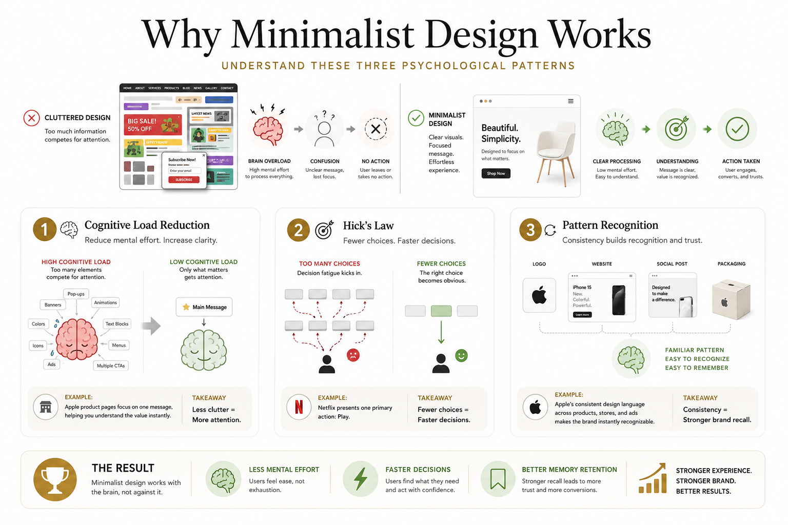
There are three psychological mechanisms that explain why minimal branding consistently outperforms its more elaborate counterpart in conversion and recall.
The first is cognitive load reduction. Cognitive load refers to the total mental effort required to process information. Dense, layered, visually complex designs impose high cognitive load. When the brain is working hard to decode a design, it has less capacity left to engage with the actual message. Minimalist design reduces that load, which means more mental bandwidth is available for the content that matters: the value proposition, the call to action, the reason to trust.
The second is Hick’s Law. This principle, well established in behavioural psychology, states that the more choices or visual stimuli a person is presented with, the longer and harder their decision-making process becomes. Every unnecessary element on a page or in an identity is a choice the brain has to process and dismiss. Minimalist branding works by removing those unnecessary decisions, directing attention precisely and efficiently toward what the brand needs the viewer to notice and act on.
The third is pattern recognition. The brain is a pattern-seeking system. When a brand uses restraint consistently, clear typography, deliberate spacing, a limited colour palette, the brain learns to recognise and process it faster over time. This is the neurological foundation of brand recall. Simpler patterns are encoded more reliably in memory, which means a minimalist brand is not only easier to engage with in the moment but more likely to be remembered when a purchasing decision arises.
Minimalist Branding Examples Worth Learning From
Looking at minimalist branding examples from the past few years, the pattern is consistent. Brands that have simplified have done so to address a specific strategic problem, not to follow a trend.
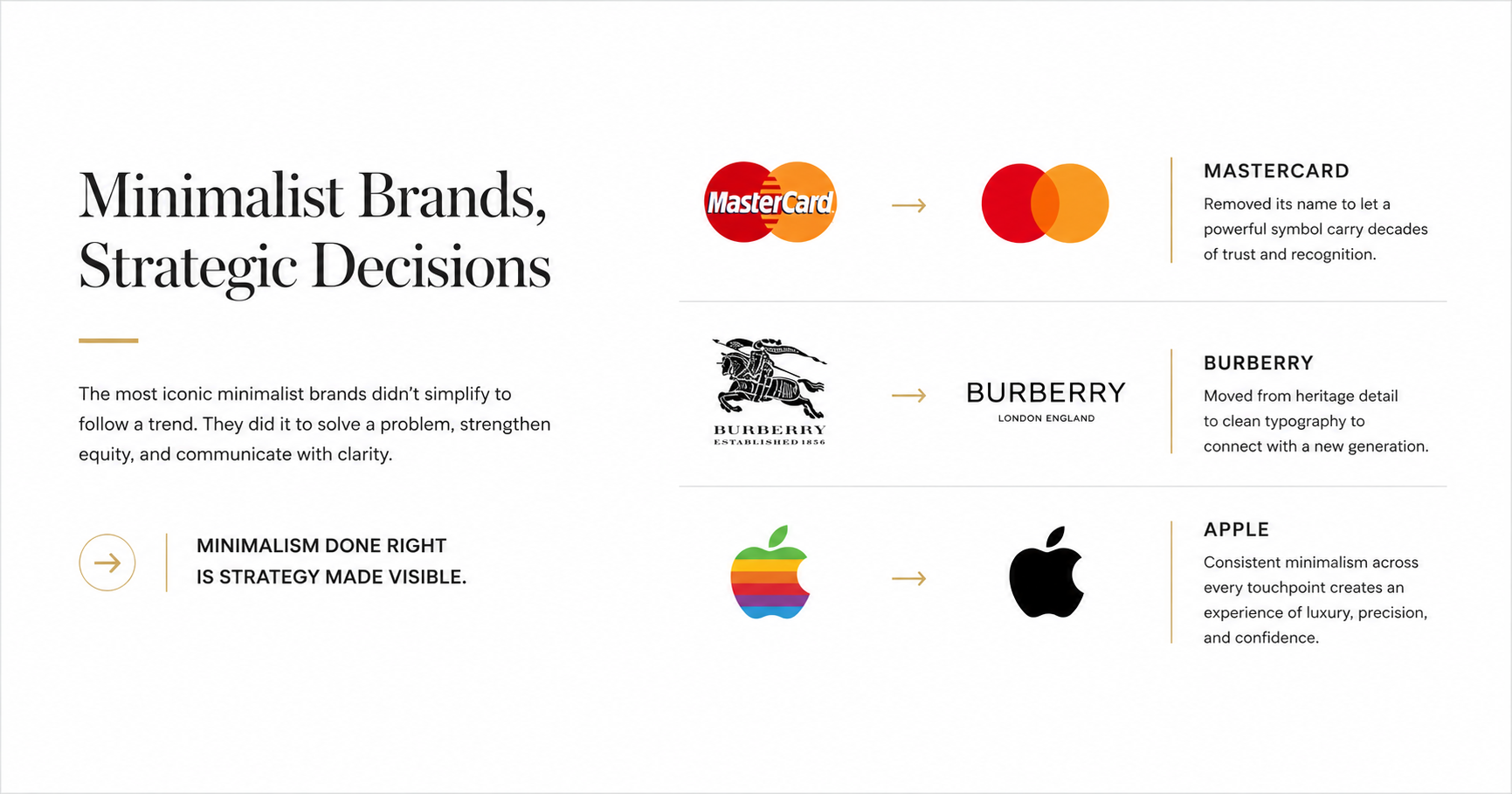
Mastercard removed its name from its logo entirely, relying on two overlapping circles to carry the full weight of brand recognition. This was possible because decades of consistent, simple visual language had built enough familiarity that the name had become redundant. The identity became more minimal as the brand equity grew, not less.
Burberry moved from a dense heritage crest to clean, spaced typography. The decision reflected a repositioning toward a younger, digitally native audience for whom heritage detail reads as inaccessible rather than prestigious. The simplification was a message in itself: this brand is confident enough not to explain itself. Apple has maintained this principle for decades, and it remains the most instructive example of minimalist luxury branding techniques in practice. Every surface, physical and digital, applies the same logic: remove everything that does not serve the experience. The result is a brand that communicates sophistication, precision, and confidence without stating any of those things directly.
“The most confident brands are the ones that say the least. Restraint, applied with intention, communicates more than complexity ever can.“
How This Applies to Your Website
The principles behind minimalist branding apply as directly to your website as they do to your logo. In many ways, the website is the higher-stakes environment, because it is where most conversion decisions are made.
A minimalist website does not mean a sparse or empty one. It means a disciplined one. Limited fonts, typically two, create visual consistency that the brain navigates without effort. A controlled colour palette, usually two to three intentional choices, guides attention toward the elements that matter most. Generous white space reduces overstimulation and gives content room to be read rather than scanned and dismissed. A clear visual hierarchy ensures that the most important information is encountered first, without the user having to search for it.
Each of these choices reflects a Neuro Design principle: design decisions made in service of how the brain actually processes information, not in service of how a design looks in isolation. The outcome is a website that feels calm, premium, and easy to trust, and one that converts at a higher rate because it removes friction at every decision point.
When Minimalism Is the Right Strategic Choice
Not every brand needs a full minimalist overhaul. But most brands benefit from asking the question that minimalism forces: what on this page, in this identity, or across this touchpoint is not earning its place?
If your brand feels cluttered or dated, minimalism can bring the clarity that reconnects your visual identity with your actual positioning. If your website has a high bounce rate, visual complexity is one of the first places to investigate. If your brand is expanding across more digital platforms, a simpler identity will serve you significantly better than a complex one as screen sizes shrink and attention spans tighten.
The businesses that get the most from minimalism in branding are those that approach it strategically rather than aesthetically. The question is never ‘does this look minimal?’ The question is ‘does this reduce friction, communicate clearly, and build trust faster than what it replaces?’
Minimalism Is Not a Style. It Is a Strategy.
The brands adopting minimal branding are not doing less. They are making harder decisions about what to keep. That discipline, applied consistently across logos, websites, and every brand touchpoint, is what produces the clarity that converts browsers into buyers and prospects into clients.
At Bixel Design, we apply minimalist branding as a Neuro Design strategy, not a visual trend. Every decision, whether it is a logo refinement, a website redesign, or a full brand transformation, is made in service of how your audience thinks, processes, and decides. If your brand is ready for that kind of strategic clarity, we would be glad to consult with our team today.
Website: https://bixeldesign.com.au/contact/
Email: divya@bixeldesign.com.au