

Most business owners check their website on a desktop. Their potential clients are checking it on a phone. That single behavioural gap is responsible for more lost leads than most businesses ever realise, because the desktop version of a site can look polished and professional while the mobile version is quietly failing on every metric that matters.
According to 2026 Australian website design data, more than 61 percent of all website visits in Australia now originate from mobile devices. For service businesses, the figure is often considerably higher because high-intent searches happen in the moment, on the commute, during a break, or from the waiting room of another appointment. If your site was not designed with that user in mind from the beginning, it is not designed for most of the people trying to reach you.
This piece explains what mobile-first web design actually means in 2026, why it is not the same as a site that simply responds to smaller screens, what it costs businesses that have not built to this standard, and a practical checklist for assessing where your current site stands.
Mobile-First Is Not the Same as Mobile-Responsive
This distinction matters and is consistently misunderstood. A mobile-responsive website is one that was designed for desktop and then adapted to display acceptably on smaller screens. A mobile-first website is one that was designed for the smallest screen first, with the desktop experience built outward from that foundation. The difference is not cosmetic. It is structural, and it determines almost everything about how the site performs for mobile users.
A responsive site that began as a desktop design will typically compress its desktop layout onto a smaller screen. Buttons that were easy to click with a mouse become difficult to tap with a thumb. Text that was readable at full width becomes small and dense. Navigation menus collapse into a format that was never tested under actual mobile use conditions. Images that loaded acceptably on a broadband desktop connection slow the page to a crawl on a mobile network. Each of these is a friction point, and each one increases the probability that the visitor leaves before completing any meaningful action.
A mobile-first approach inverts this. Content hierarchy is established for a small screen first, which forces better editorial decisions about what genuinely needs to be on any given page. Touch targets are sized and spaced for fingers rather than cursors. Navigation is built for thumb reach rather than cursor precision. Page weight is controlled from the outset because mobile network constraints set the performance ceiling. The result is a site that feels effortless on the device most visitors are using, and scales gracefully to larger screens rather than shrinking awkwardly from them.
A site that works on mobile is not the same as a site designed for mobile. One is a compromise. The other is a strategy.
Why Google Has Already Made the Decision for You

Since 2019, Google has operated on a mobile-first indexing model. This means that when Googlebot crawls your website to determine how it should rank in search results, it primarily uses the mobile version of your site, not the desktop version, regardless of what device the person searching is using. If your mobile site contains less content than your desktop version, loads slowly, has hidden navigation elements, or presents a degraded user experience, your search rankings reflect that, across all devices.
In 2026, Google has refined this further. According to web design statistics compiled by Loopex Digital, only 47 percent of sites currently meet Google’s Core Web Vitals thresholds, the three performance metrics Google uses to measure real-world user experience quality. These are Largest Contentful Paint, how long the main content takes to load; Cumulative Layout Shift, how much the layout moves around as the page loads; and Interaction to Next Paint, how quickly the page responds when a user taps or clicks. A site that fails these benchmarks is a site that Google has already concluded does not provide a satisfactory experience. The rankings follow from that conclusion.
For Australian businesses investing in SEO, this creates a specific and often unacknowledged problem. A content strategy and backlink programme built on top of a site that fails Core Web Vitals is operating at a structural disadvantage that no amount of content volume or keyword targeting can fully compensate for. The foundation has to be right before the strategy on top of it can perform.
What Poor Mobile Performance Costs in Real Terms
The commercial case for mobile-first web design is not abstract. The data connecting mobile performance to revenue is direct and consistent across every major study conducted in 2025 and 2026.
According to Colorlib’s 2026 web design statistics, 53 percent of mobile visitors abandon a site if it takes more than three seconds to load. That is more than half of your mobile audience lost before a single word of your content has been read, purely because of page speed. For context, the average mobile site in Australia still takes between three and five seconds to fully load. The average business is therefore consistently operating in the zone where the majority of mobile visitors are statistically likely to leave.
The conversion gap compounds this further. Despite mobile accounting for the majority of web traffic, Colorlib’s data shows that mobile conversion rates average 2.2 percent compared to 4.4 percent on desktop, meaning mobile converts at exactly half the rate of desktop. This is not because mobile users are less likely to buy or enquire. It is because most mobile experiences are still not good enough to support the decision. For businesses that have invested properly in responsive website design built mobile-first, the gap narrows substantially. For those still running a compressed desktop experience on small screens, it remains, silently draining the commercial potential of every mobile visit.
Between 2025 and 2026, Australian SMEs increased their investment in website and UX by 22 to 28 percent, the largest annual increase recorded in the past decade. The businesses driving that increase are not doing so for aesthetic reasons. They are responding to the measurable commercial cost of mobile underperformance that became impossible to ignore once they began attributing lost leads correctly.
53% of mobile visitors leave if a page takes more than 3 seconds to load. Most Australian sites load in 3 to 5 seconds. The maths is not in your favour.
The Psychology of Mobile: Why Users Behave Differently
Understanding mobile user experience requires understanding that mobile users are not just desktop users on a smaller screen. They are operating in fundamentally different contexts with fundamentally different cognitive states, and those differences change everything about how a site needs to be structured to convert them.
Mobile searches happen in moments of immediate intent. Someone searching for a financial adviser, a physiotherapy clinic, or a commercial lawyer on their phone is frequently in an active decision-making moment, not a research phase. They have a need right now, and they are looking for the fastest path to a solution. This creates an opportunity that a well-designed mobile-first website can capture directly: a click-to-call button visible without scrolling, an appointment booking form that works cleanly on a small screen, a lead capture form with three fields rather than ten.
The cognitive load dimension matters here as well. Mobile users are frequently multitasking or operating in environments with divided attention: on public transport, in waiting rooms, between meetings. Their available mental bandwidth is lower than a desktop user sitting at a desk with dedicated focus. A site that presents visual complexity, dense navigation, or a layout that requires zooming and pinching is asking for cognitive effort the mobile user does not have available. The brain’s response is to exit. Not because the content was irrelevant, but because the effort of accessing it exceeded the patience budget in that moment.
This is where Neuro Design principles become directly applicable to mobile performance. Reducing cognitive load, creating clear visual hierarchy, eliminating friction from key conversion actions, and ensuring the most important information is encountered within the first visible screen on a mobile device are not design preferences. They are the structural requirements for converting a mobile visitor who has high intent but limited patience.
How to Check if Your Site Is Genuinely Mobile-First
For businesses wanting to assess their current mobile website design honestly, the following checklist covers the most commercially significant dimensions. Each item represents a specific failure mode with a specific conversion cost.
- Load time on mobile network: Test your site using Google PageSpeed Insights with the mobile setting selected. A score below 50 indicates significant performance issues. A score above 90 is what modern Australian competitors are increasingly achieving.
- Core Web Vitals pass rate: Google Search Console provides a Core Web Vitals report for your domain. Any pages marked as Poor or Needs Improvement are pages that Google has already flagged as providing an inadequate mobile experience.
- Tap target sizing: Open your site on an actual mobile device and attempt to tap every button, link, and navigation element. Google recommends a minimum tap target size of 48 by 48 pixels. Anything smaller creates friction and error that erodes trust.
- First-screen CTA visibility: On your homepage and key service pages, can a mobile visitor see a clear call to action without scrolling? If the answer is no, the user with the highest intent is being asked to do the most work before they can act.
- Form field count on mobile: Count the fields on your primary conversion form as it appears on a mobile screen. Research consistently shows that reducing form fields from ten to four can produce conversion lifts of up to 120 percent on mobile.
- Text readability without zooming: Google’s minimum recommended body text size for mobile is 16 pixels. Anything smaller forces the user to pinch and zoom, which is a clear failure of mobile-first design and a signal to Google that the mobile experience is inadequate.
- Horizontal scrolling: Any horizontal scrolling on a mobile device is a structural failure. It indicates that elements have been sized for desktop and not adapted for the smaller viewport. It also fails Google’s mobile usability standards directly.
If more than two of these items produce an unsatisfactory result on your site, the mobile performance gap is almost certainly costing you leads. The question is not whether to address it but in what order.
What Mobile-First Design Looks Like in Practice
A properly executed mobile-first web design project for an Australian service business begins with a different set of questions than a traditional design brief. What is the single most important action a mobile visitor needs to be able to take? What information do they need to see first to trust the business enough to take that action? What can be removed from the mobile experience without reducing its effectiveness? How does the design account for thumb reach on screens of different sizes?
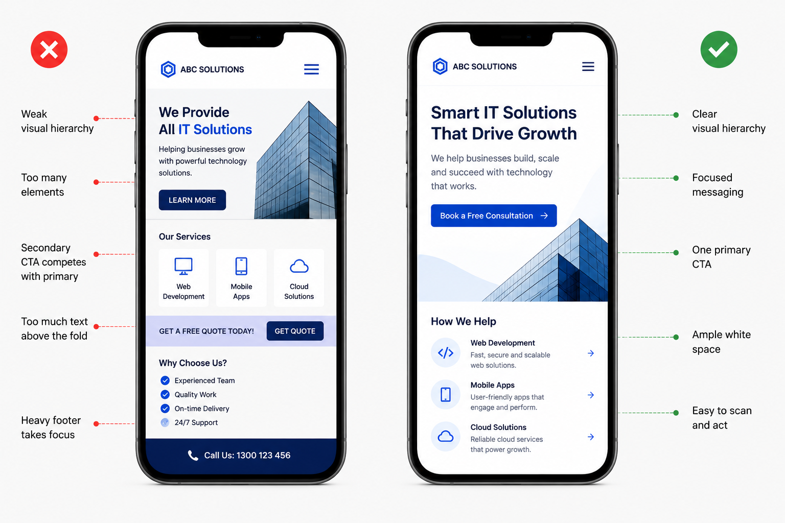
The visual outcomes of these decisions are typically characterised by generous white space, large and clearly labelled tap targets, a single dominant call to action per screen, minimal navigation that prioritises the most critical paths, and typography sized for comfortable reading without adjustment. These are the same principles that define strong Neuro Design: reducing effort, building confidence, and removing every obstacle between the visitor’s intent and the action you need them to take.
According to Melbourne Web Digital’s 2026 website design trends report, the most damaging design choices for Australian businesses in 2026 are those that prioritise visual novelty over function: video backgrounds that slow mobile load times, excessive animations that distract from content, navigation that hides key information behind unclear labels, and generic templates that perform poorly on mobile because they were never designed with mobile performance in mind. A responsive website design that was built from a desktop template is almost always one of these cases.
When to Prioritise Mobile-First Over a Full Redesign
Not every site that underperforms on mobile requires a full rebuild. For some businesses, targeted mobile optimisation, improving load times, resizing tap targets, simplifying forms, and clarifying the mobile navigation, delivers meaningful conversion improvement without the time and investment of a complete redesign.
A full mobile-first web design rebuild is the appropriate decision when the current site’s architecture is fundamentally desktop-oriented and cannot be adapted without rebuilding core templates, when page speed issues are driven by the underlying technology stack rather than surface-level assets, or when the site is more than three years old and has never been substantially updated for mobile. According to Weblumino’s 2026 Australia website cost guide, responsive website design is now baked into the base cost of any professionally built site in Australia. A site that does not work on mobile is not considered finished in 2026. If yours was built before that standard became the default, it was built to a specification that no longer applies.
You can read more about the investment case in our related post on whether redesigning your website equals more ROI, which covers how to calculate the return on a rebuild specific to your traffic volume and current conversion rate.
The Mobile Experience Is the Brand Experience Now
In 2026, for the majority of Australian businesses, the mobile version of a website is not a secondary consideration. It is the primary one. It is the version most visitors see, the version Google ranks, and the version that determines whether the investment in driving traffic to the site produces a return or disappears into a high bounce rate and a stagnant enquiry form.
A site that was not designed mobile-first is not a site that is doing its job. It is a site that is doing part of its job for part of its audience, and losing the other part to competitors whose mobile experience is better. The gap between those two positions is not a design preference. It is a measurable commercial difference.
At Bixel Design, every website we build is designed mobile-first as standard, informed by Neuro Design principles and built to meet 2026 Core Web Vitals benchmarks. If you want to understand exactly where your current site stands and what it would take to close the gap, we would be glad to consult with our team today.
Website: https://bixeldesign.com.au/contact/
Email: divya@bixeldesign.com.au